Work · Cyclesport
A scalable bicycle brand that brings speed and craftsmanship together.
Cyclesport was set up around one clear thought: cycling should be fun, easy and transparent. The concept combines the speed and clarity of a fast-food restaurant with the craftsmanship of a bicycle specialist. That calls for a brand that radiates energy, breathes service and is instantly recognisable – in the store, on the street and online.
- Client
- Cyclesport
- Location
- Apeldoorn en Deventer
- Made
- Logo and visual identity
- Brandbook
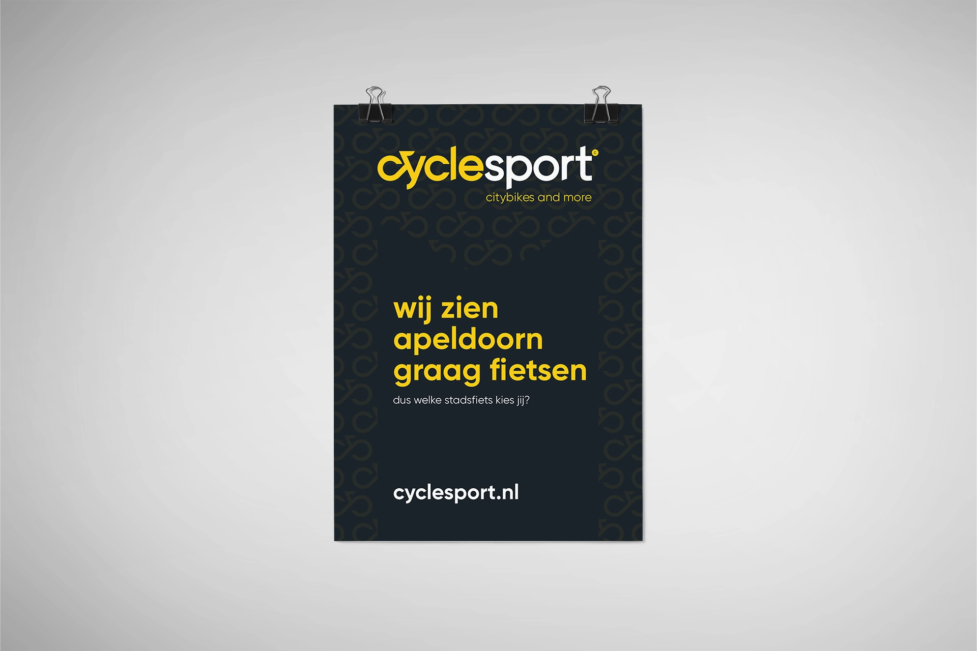
- Campaign concept and strapline
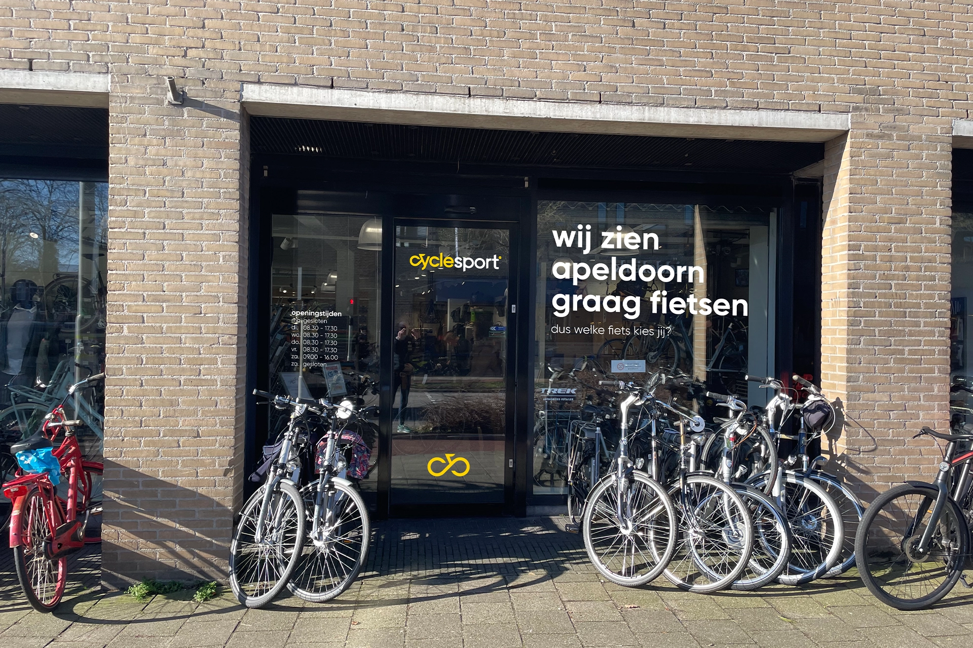
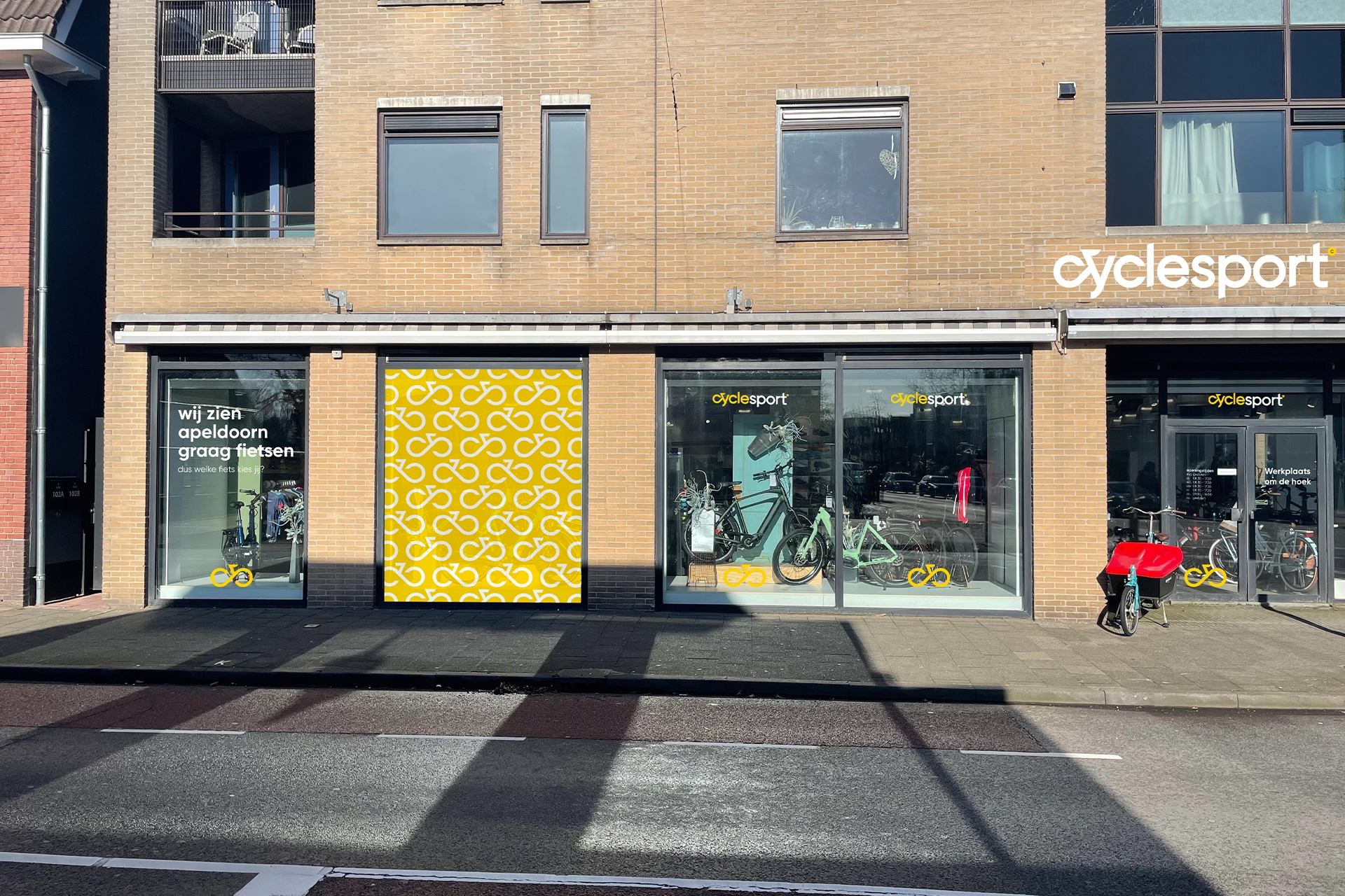
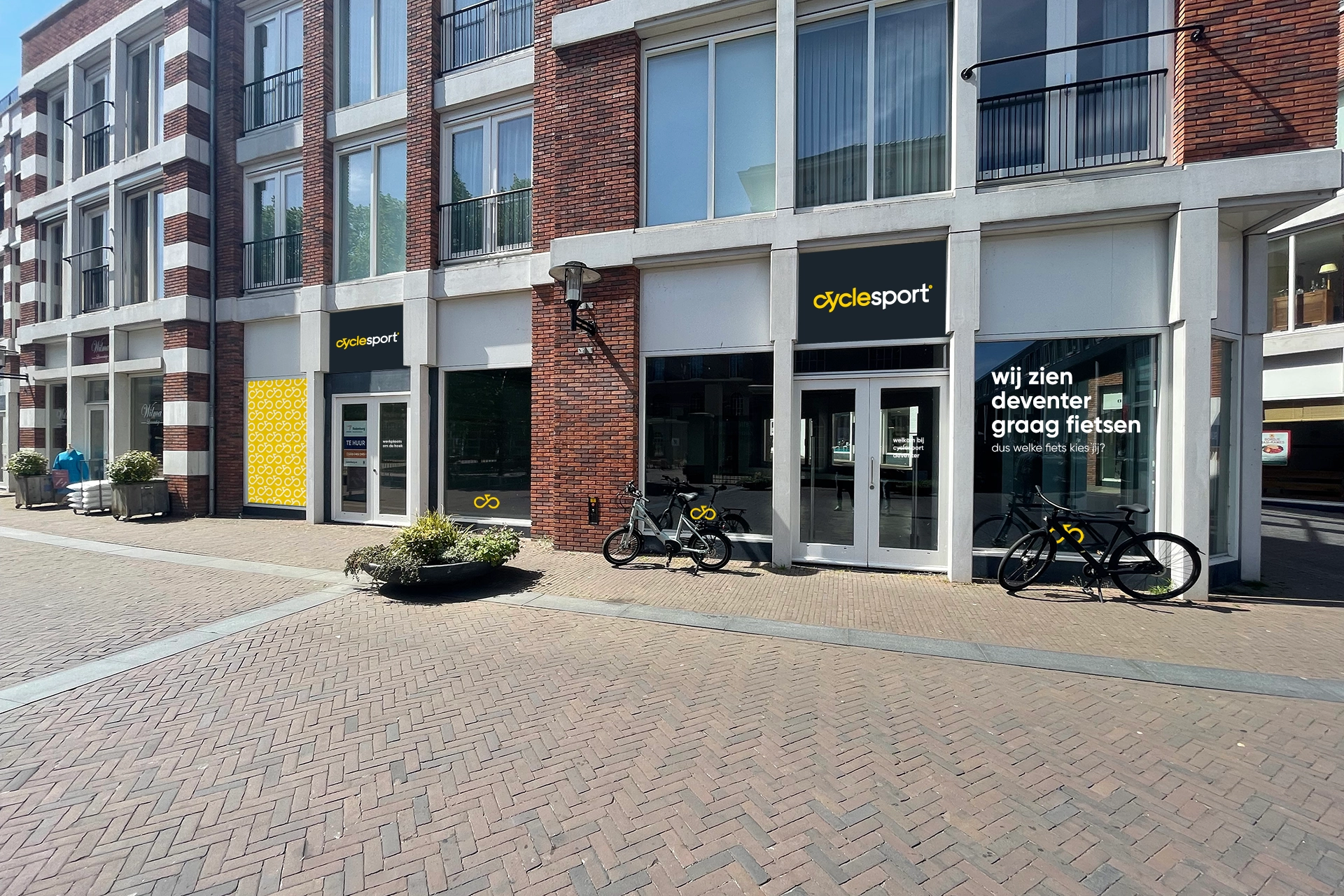
- Signage for the stores
- Online applications
Consistent in look and flexible in use. In the store, on the street and online.
Brand Design™.
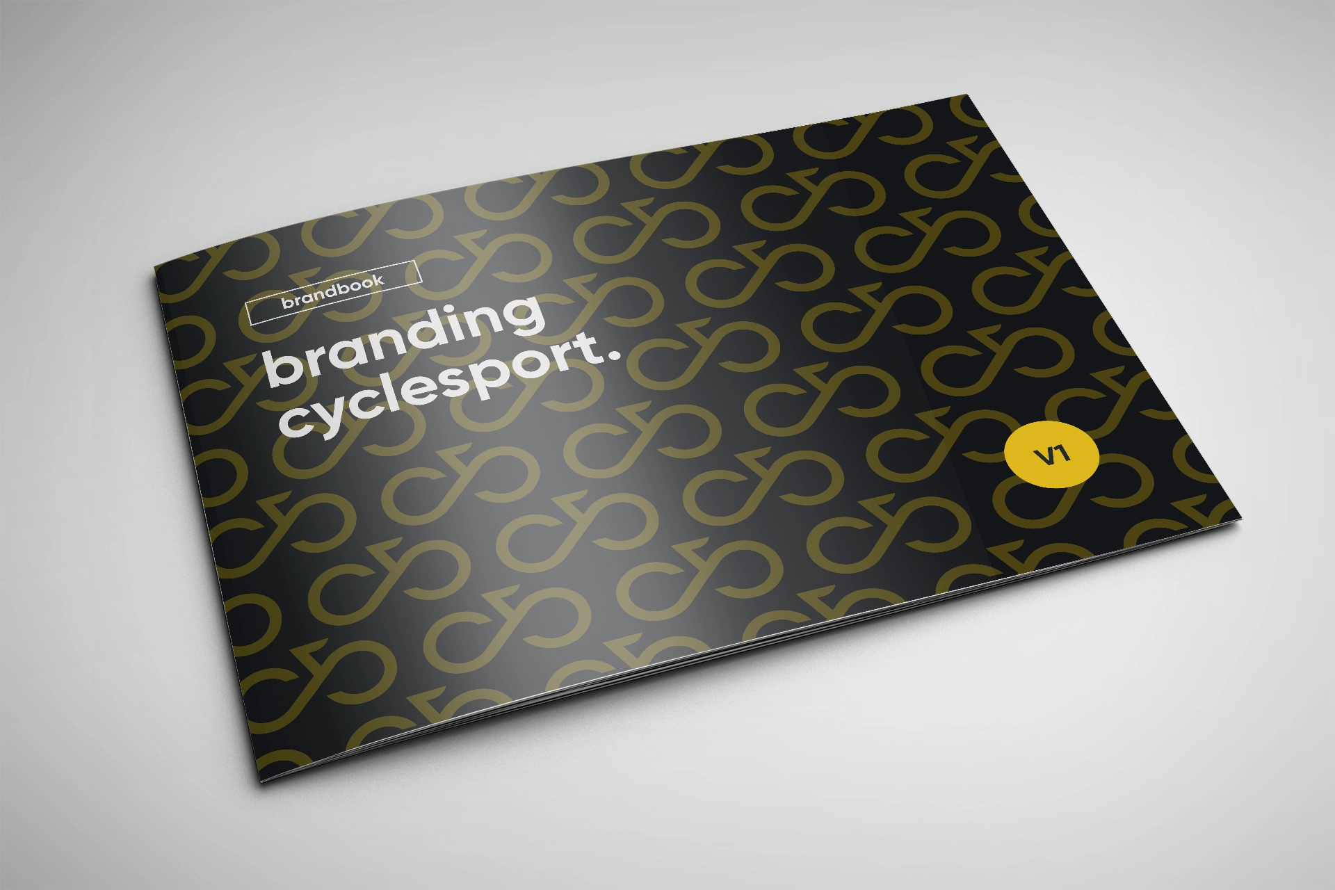
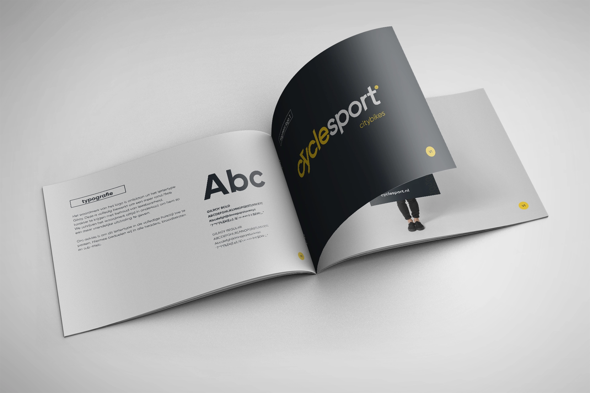
The brand identity of Cyclesport is built around clarity, pace and accessibility. Logo, colour and typography together form a visual line that reads quickly, inspires trust and suits a modern two-wheeler concept.
Brand Activation™.
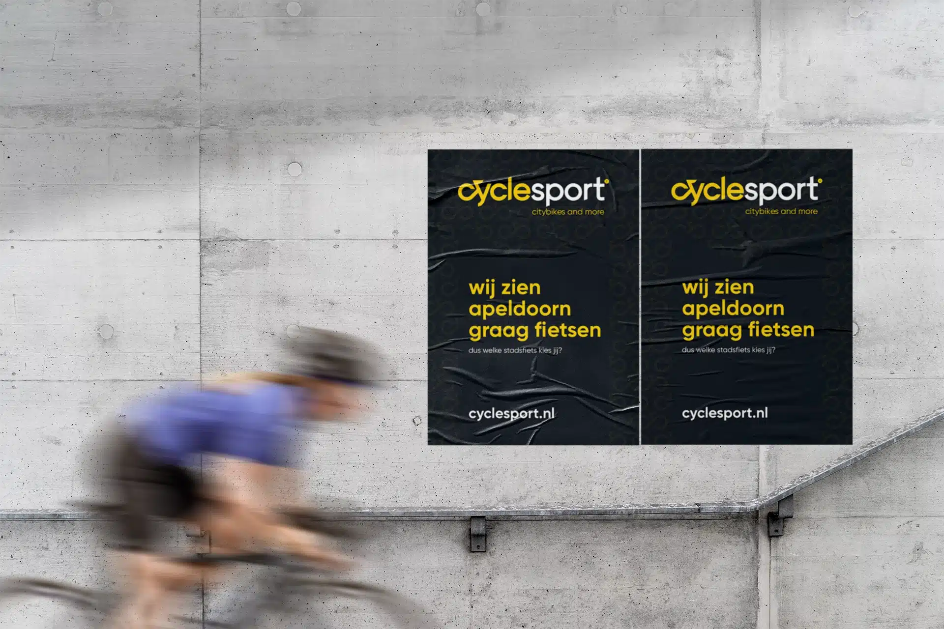
The brand has been carried through into the complete store experience. From signage to communication in and around the stores: everything contributes to recognition and ease of use, without detracting from quality and service.

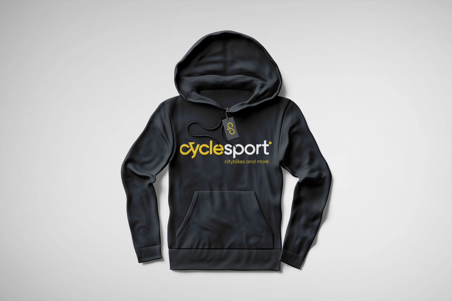
A brand that holds together.
By building Brand Design and Brand Activation from one brand foundation, Cyclesport has grown into a recognisable and scalable concept. The strapline ‘Wij zien Apeldoorn graag fietsen’ (‘We love to see Apeldoorn cycling’) anchors the brand locally, while the visual structure can easily be rolled out to other cities. That keeps the brand consistent in look and flexible in use – exactly what is needed to make cycling accessible and attractive to a broad audience.
Our role.
We translated the concept into a brand structure that is scalable and safeguarded the coherence between identity, store experience and communication.
Why this works.
The brand combines speed and clarity with trust and quality. That makes Cyclesport feel instantly understandable and professional.