Work · DOCKR Mobility
A mobility brand that makes electric driving in the city self-evident.
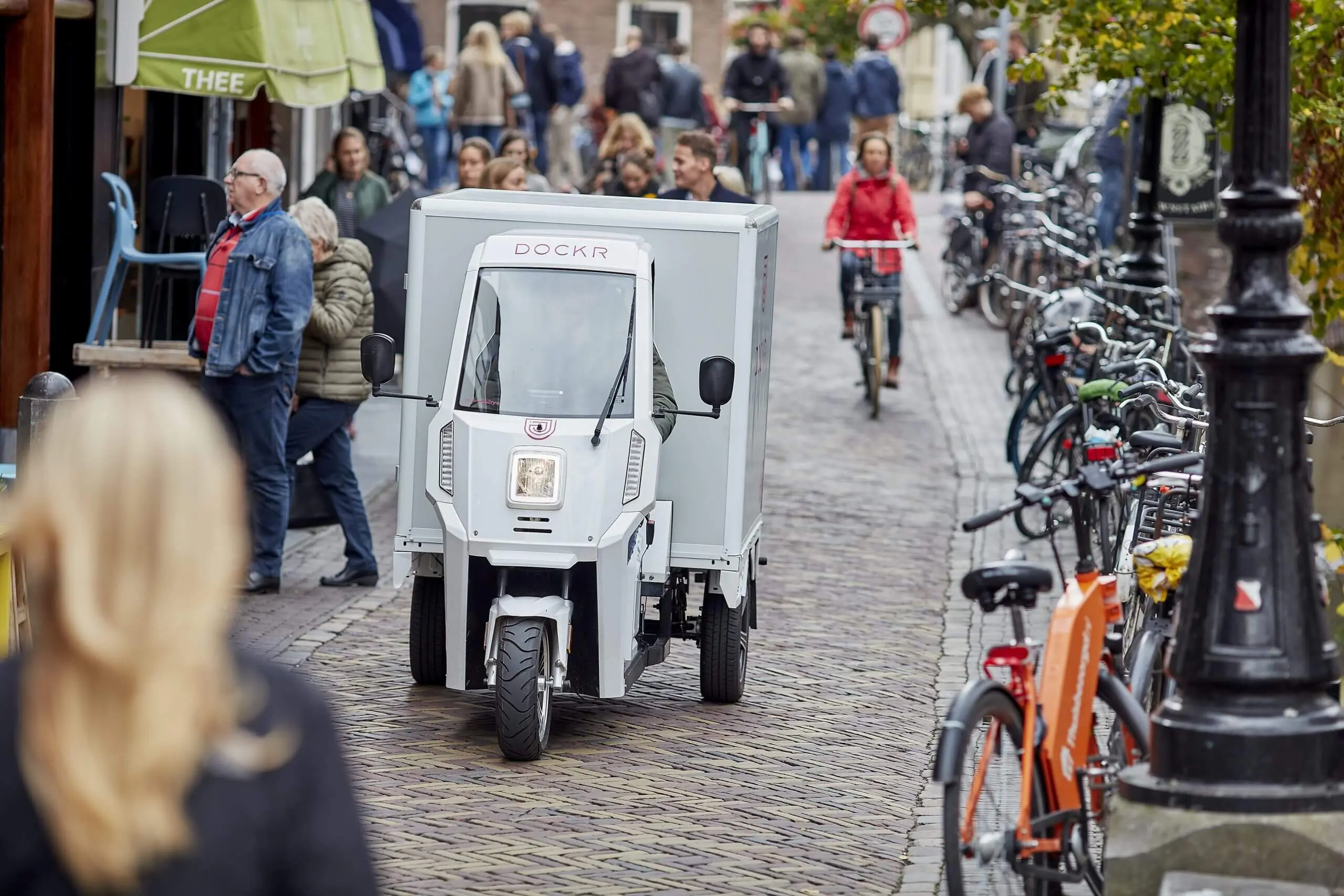
DOCKR Mobility works towards clean, safe and accessible city centres by taking the hassle out of the switch to electric logistics for businesses. That ambition calls for a brand as clear and agile as the city itself: accessible, scalable and focused on progress.
- Client
- DOCKR Mobility
- Location
- Utrecht
- Made
- Logo update
- Visual identity
- Brandbook
- Advertising
- Concept and creative development
Sustainable transport does not have to be complicated, but logical, practical and ready for the future.
Brand Design™.
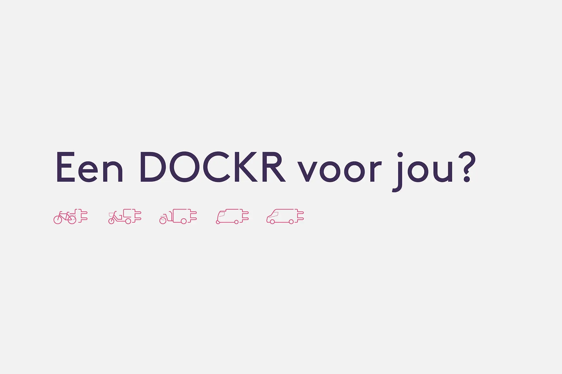
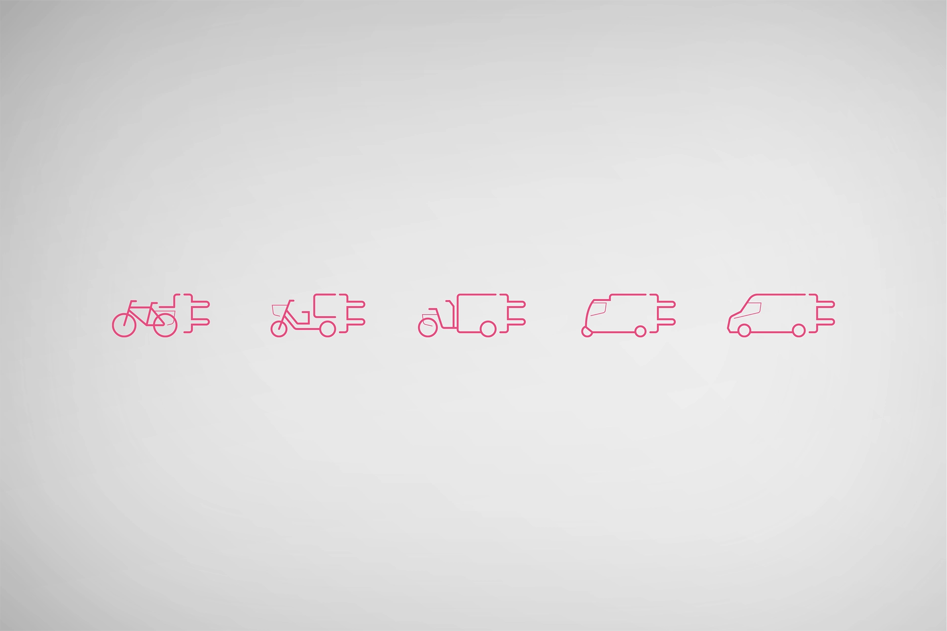
The existing logo was given a subtle update for better balance and digital use. From that basis, the branding was brought back to its essence: strong typography, high-contrast colour and a visual style that conveys energy and movement.
Brand Activation™.
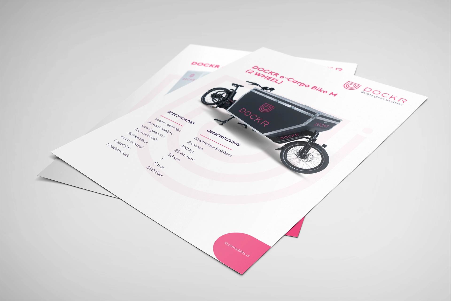
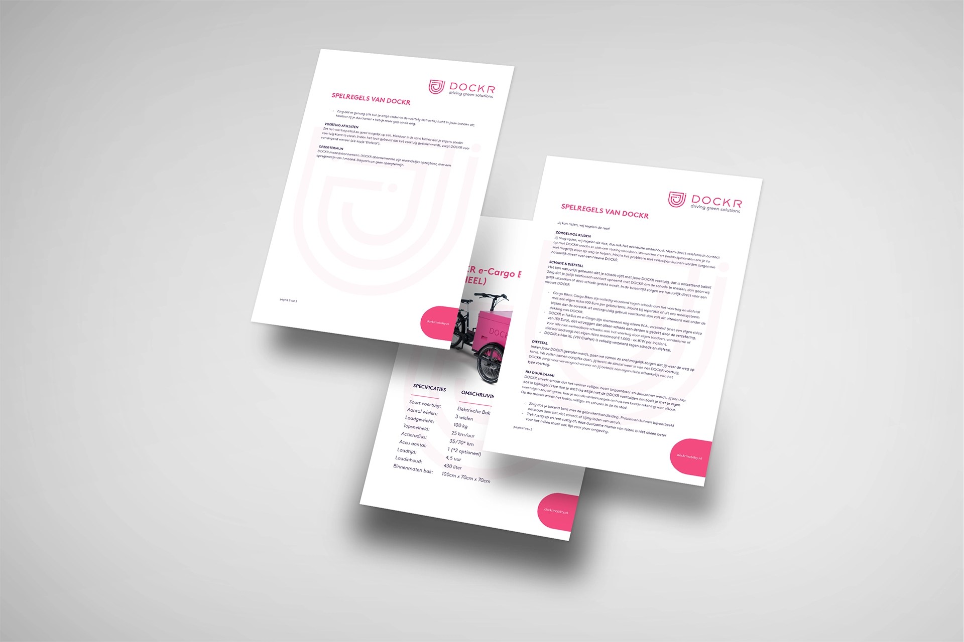
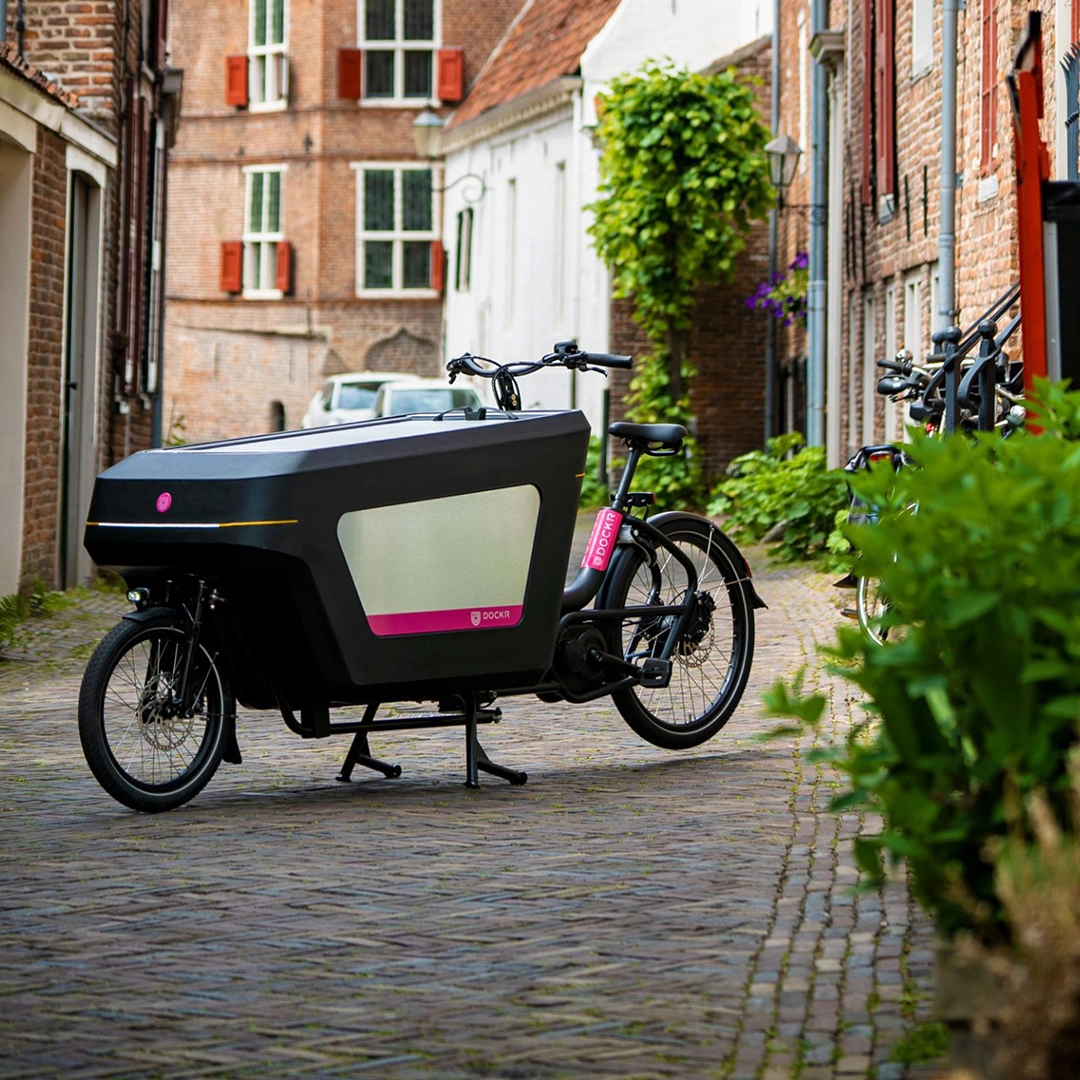
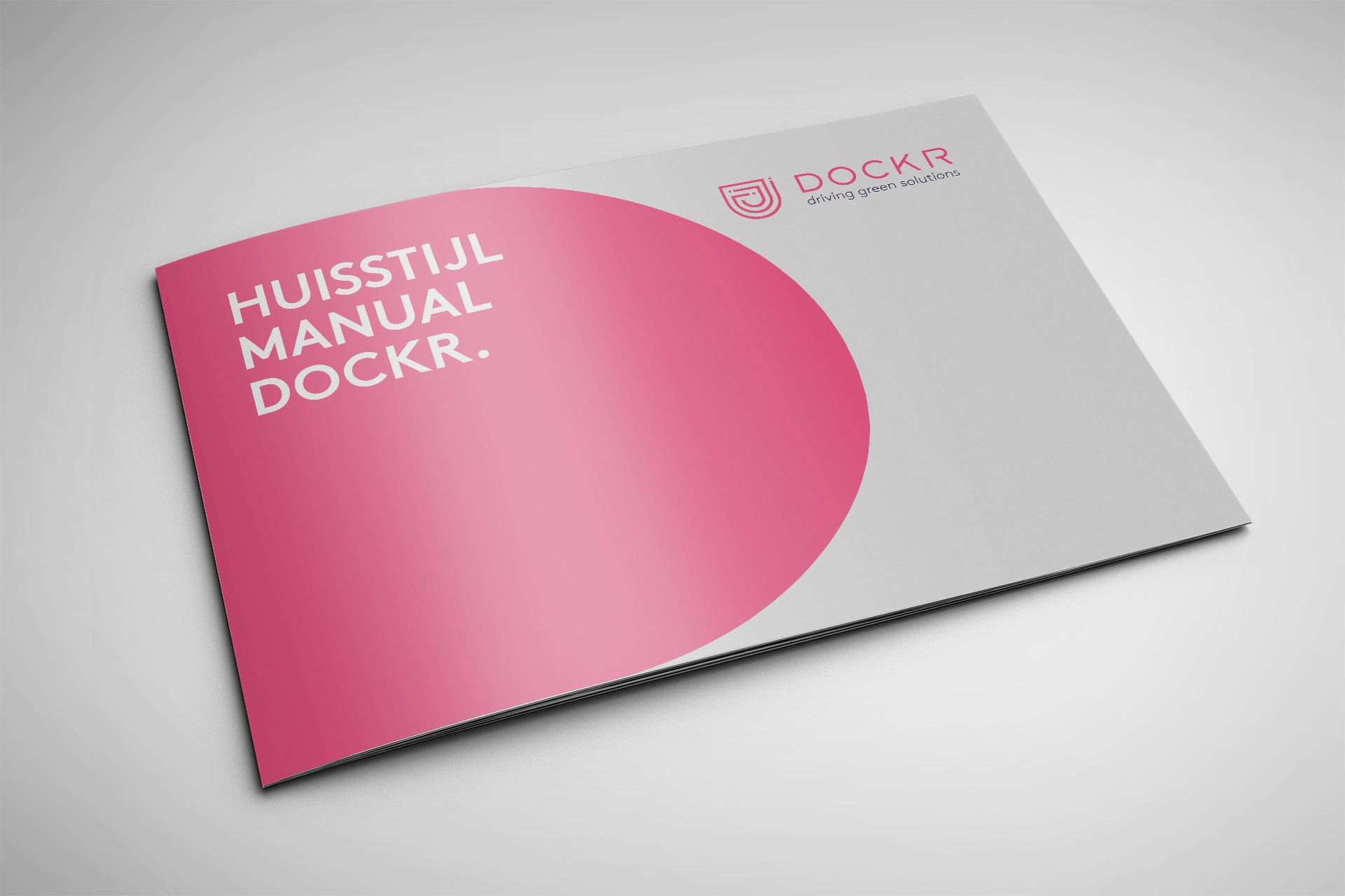
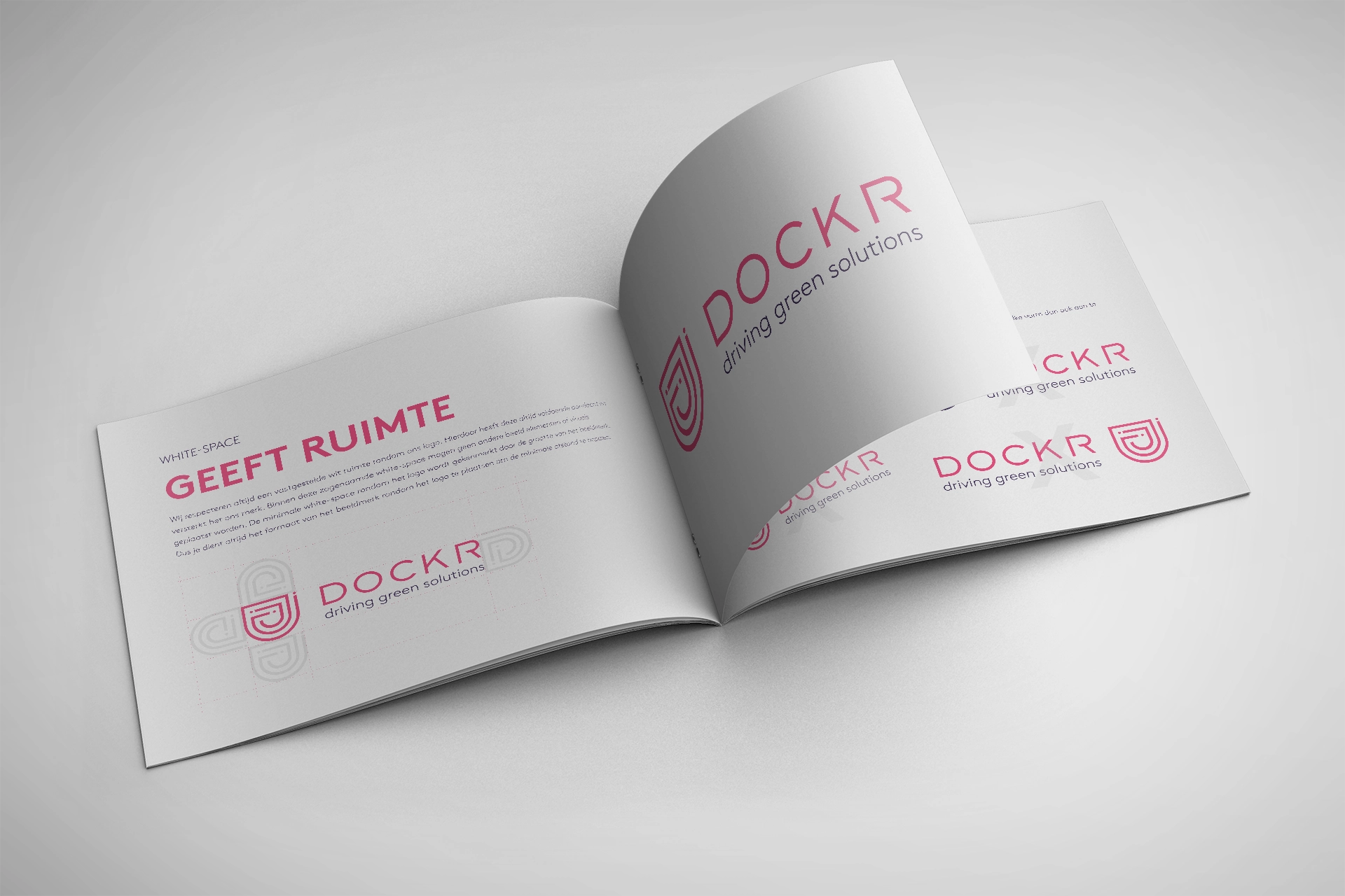
The brand identity has been carried through into communication and materials that support businesses in their daily practice. The brandbook serves as the guide, connecting strategy, tone of voice and design principles into one coherent whole.
A brand that holds together.
By developing Brand Design and Brand Activation from one core, a brand has emerged that removes complexity and encourages movement. The clear visual structure makes DOCKR recognisable in an urban context, while the accessible tone brings the brand close. That way DOCKR shows that sustainable transport does not have to be complicated, but logical, practical and ready for the future.
Our role.
We brought the brand back to its core and safeguarded the coherence between strategy, design and application, so DOCKR can grow with the city.
Why this works.
The combination of clear brand choices and practical usability creates trust and recognition, even in a fast-changing urban environment.