Work · Teunissen & Becking
When a brand rings true, materials fall into place by themselves.
Teunissen & Becking operates in an environment where trust, precision and professionalism must feel self-evident. That calls for a brand that radiates calm and communicates consistently. From that coherence, we looked at which materials the brand needed to become visible and tangible.
- Client
- Teunissen & Becking
- Location
- Almelo
- Made
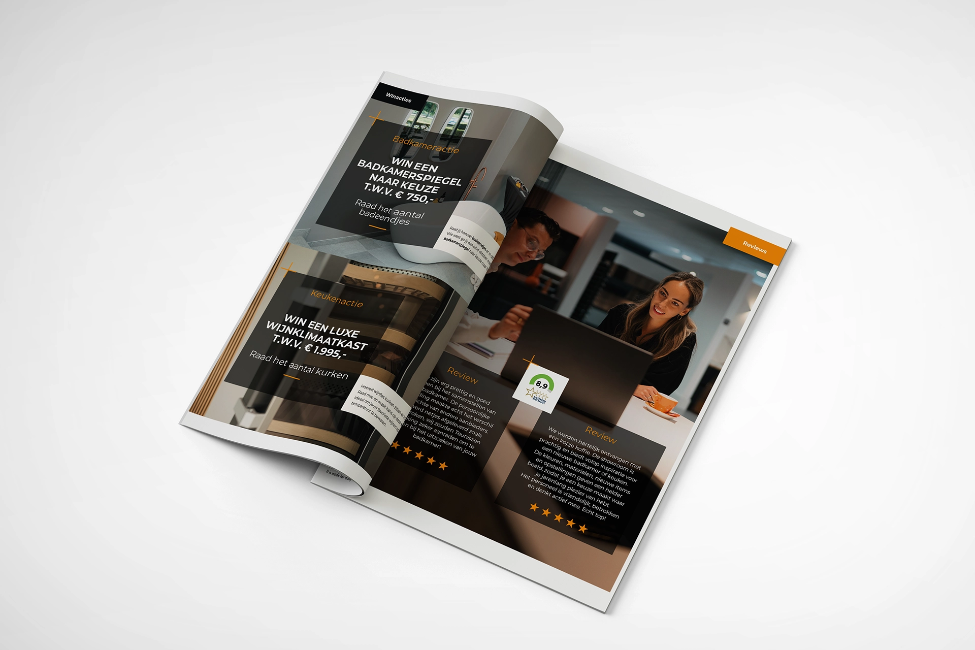
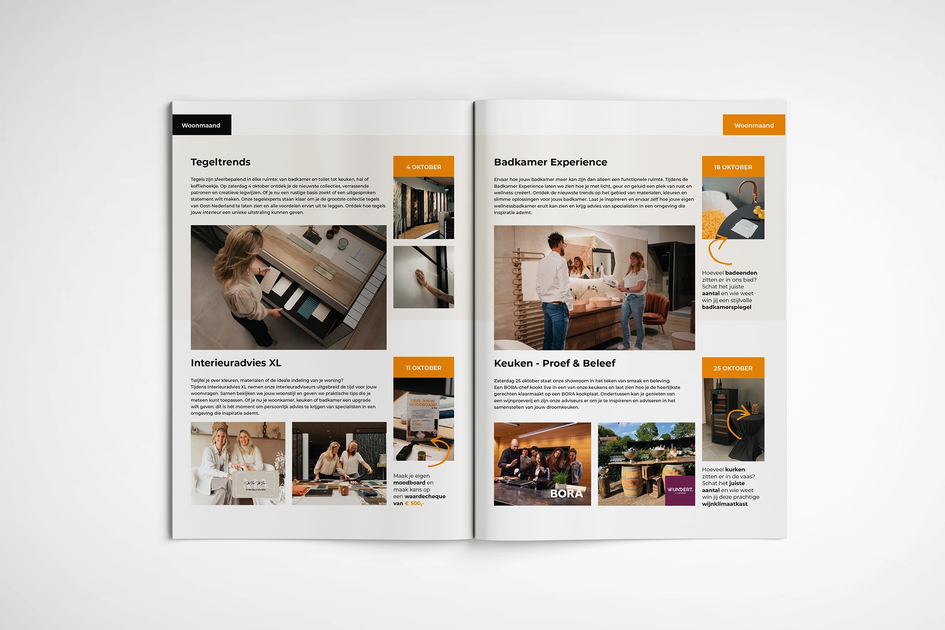
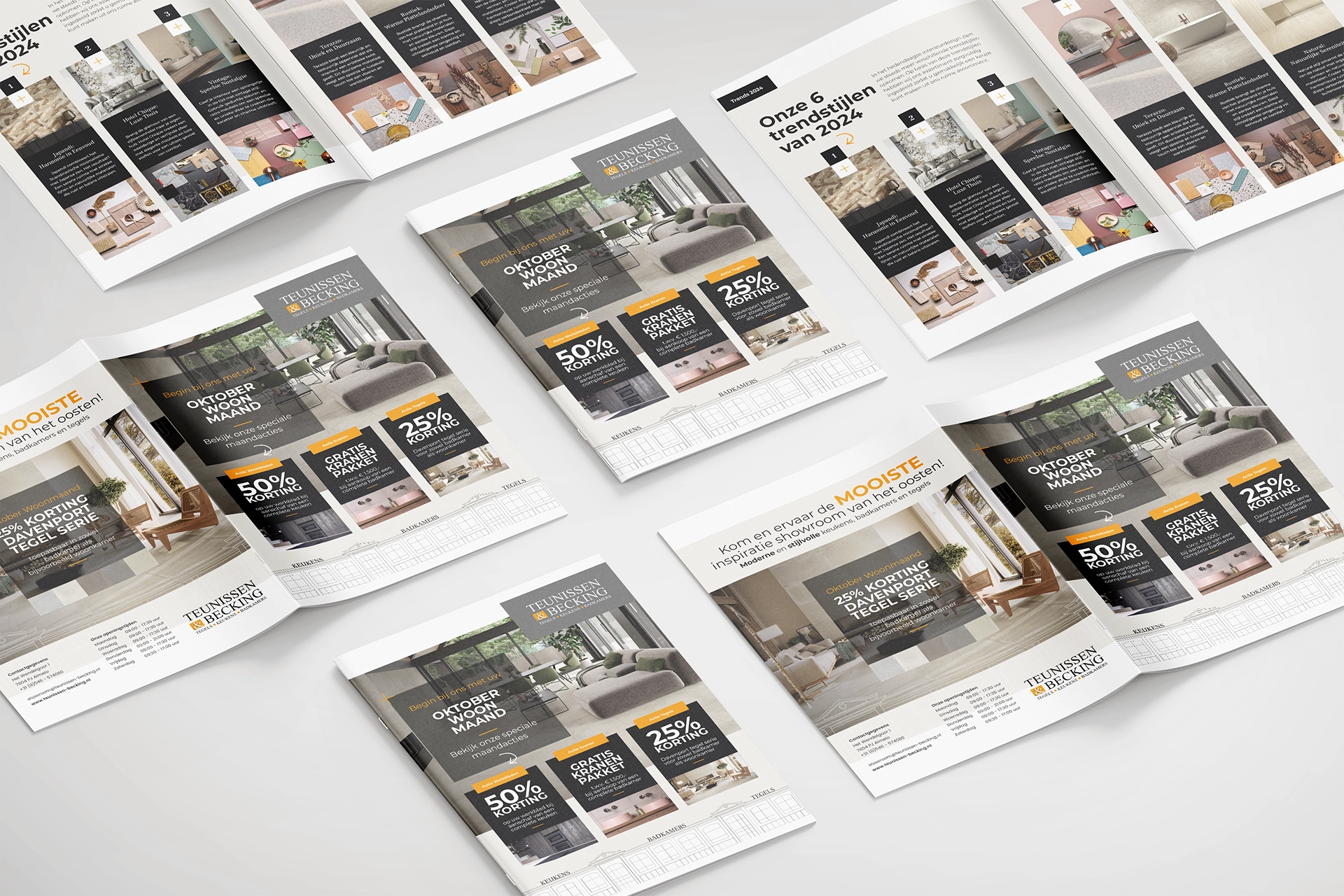
- Corporate brochure
- Visual templates
- Supporting print
Coherence leads, not the medium. Calm, recognition and a professional look.
Brand Design™.
The visual identity has been worked out in typography, layout and hierarchy. These choices create calm, recognition and a professional look that confirms the brand, without explanation.
Brand Activation™.
The materials are used in conversations, presentations and client contact. They act as carriers of the brand and support the story in practice, without taking the lead role.
Materials developed.
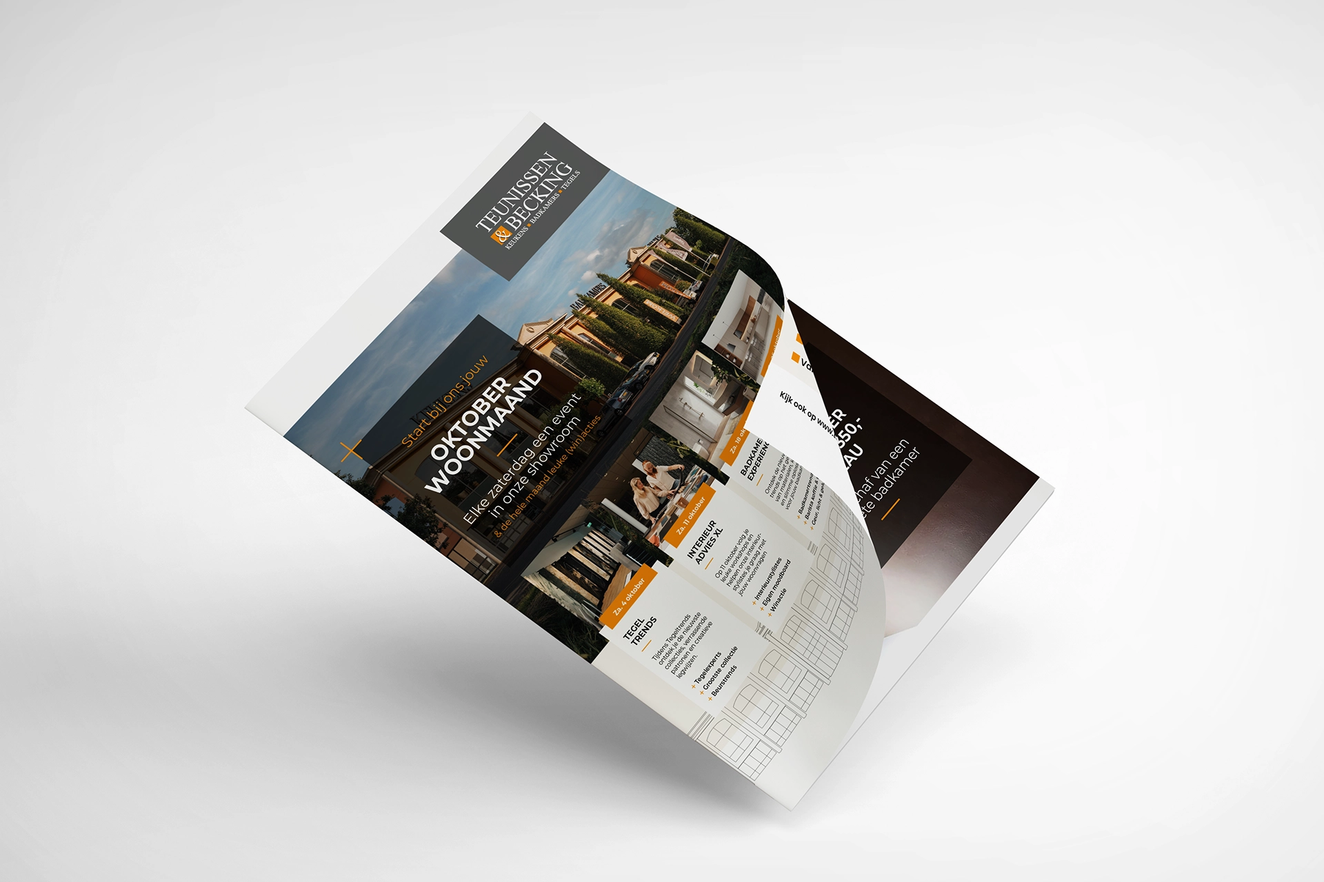
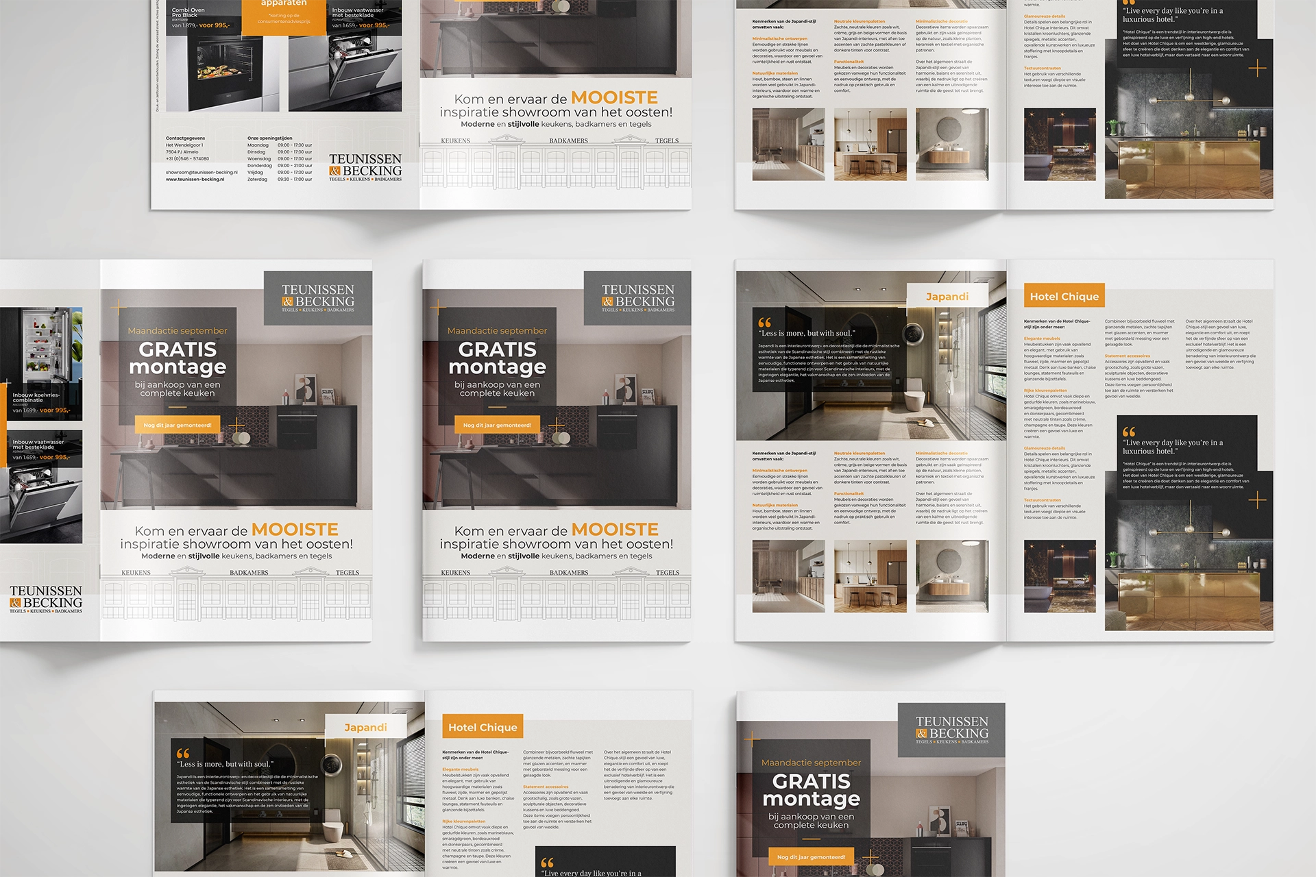
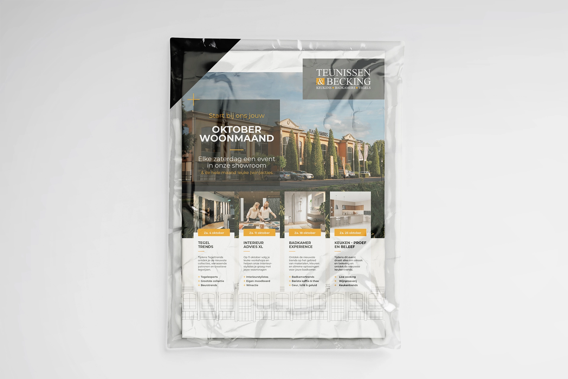
This case produced a range of communication materials, including a corporate brochure, visual templates and supporting print. All materials come from one brand foundation and together form a consistent brand look.
A brand that holds together.
This case shows how Brand Design and Brand Activation reinforce each other when they come from one brand foundation. Design and activation are not separate steps, but expressions of the same idea. The materials are visible, but not leading. What remains is the coherence that creates calm, recognition and trust – without explanation.
Our role.
Whether in print, a presentation or a conversation: the look stays consistent. That brings calm to communication and recognition for the recipient. The brand stands, even when the medium changes.
Why this works.
Because Brand Design and Brand Activation were developed from the same basis, the communication stays consistent and future-proof. Coherence leads, not the medium.