Recognition is often seen as something that comes by itself. If a brand is visible for long enough, people will start to recognise it. That is understandable, because that is how it feels in hindsight. But recognition is not a by-product of time. It is the result of form that keeps confirming the same thing. At Dutch Design Week in October there was a shirt that makes this clear, by doing exactly the opposite.
A shirt that does not want to be seen
Artist Simon Weckert made Digital Camouflage. To anyone looking at it, it is a shirt with a colourful, abstract pattern. To a camera with AI image recognition, it is something else. The pattern makes the software stop recognising the wearer as a person. Weckert made it in response to a trial of AI camera surveillance at Kottbusser Tor in Berlin.
The pattern was not designed by eye. Weckert had a system test again and again what the camera does and does not see, until the form was right. According to him, a machine's blind spots cannot be felt by people. Only the machine can show what it misses.
More than a hundred years earlier, at sea
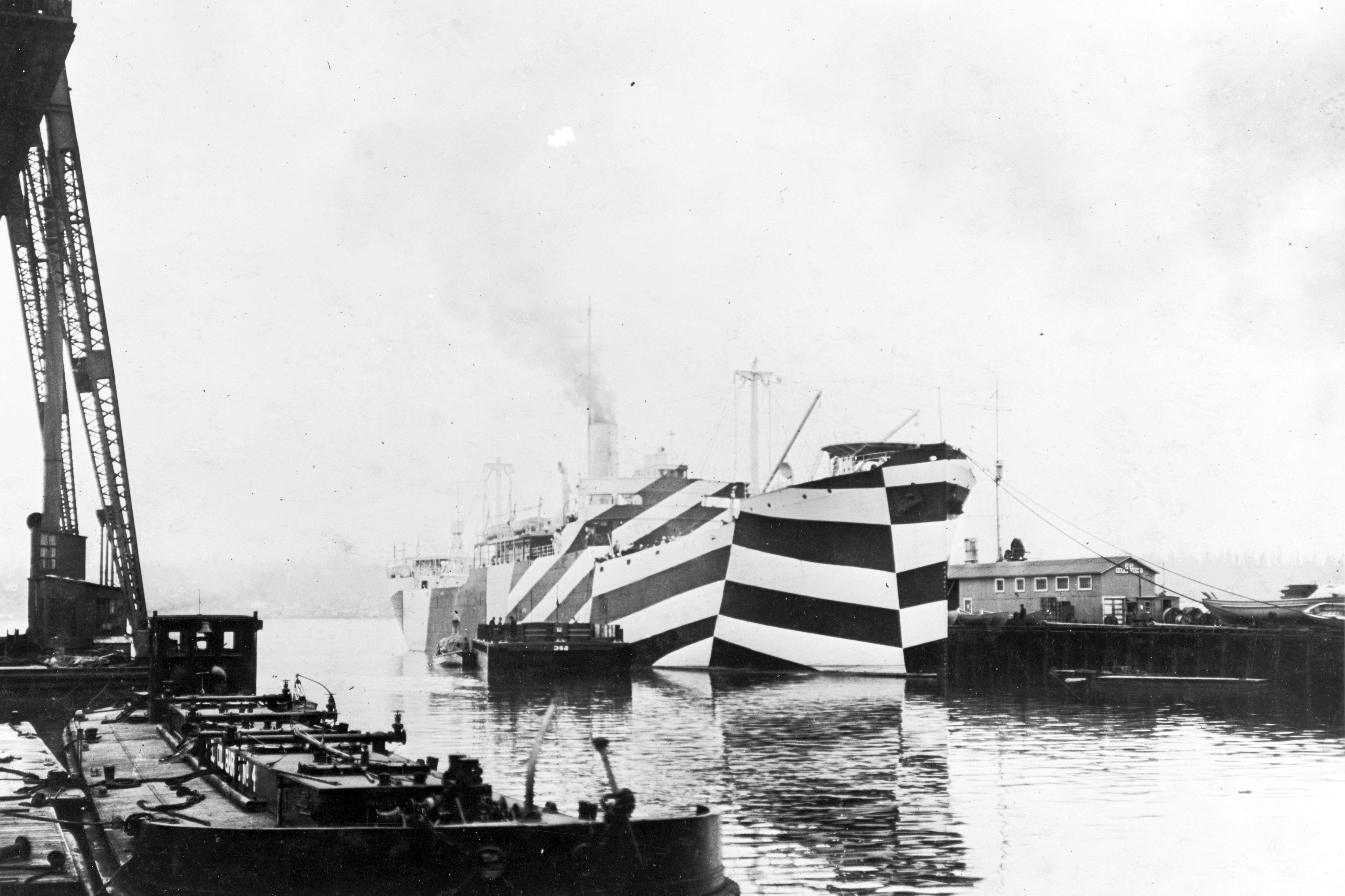
The idea is older than AI. In 1917 the British painter Norman Wilkinson proposed that ships should no longer try to hide. At sea it never worked anyway. He gave them hard lines and contrasting planes. The aim was not invisibility. Those patterns were meant to make a submarine commander misjudge a ship's course, speed and distance. Thousands of ships sailed like that.
Dazzle and Digital Camouflage work the same way. The image is there, but the observer reads it wrongly. With the ship, the course no longer added up; with the shirt, the camera no longer sees a person. What is visible is no longer understood.
Recognising is reading
That is the lesson for brands. Recognition does not arise because something is seen, but because it can be read. A colour, a shape or a way of writing that keeps coming back makes a brand readable. Every time something fits with what came before, it becomes easier to recognise. Every time something deviates, it becomes harder.
Many brands unintentionally do what Weckert does on purpose. They are visible, sometimes even striking, but slightly different at every point of contact. A different tone on the website, a different style in the campaign, a different story from sales. The brand is there, but it cannot be read.
- Without coherenceThe brand is seen.
Every material says something different.
Recognition has to start over every time. - With coherenceThe brand is read.
Every material confirms the same thing.
Recognition grows with every contact.
Form is never neutral
If you can design something not to be recognised, you show that recognition is designed too. Form always steers. It helps someone place something, or it makes that difficult. There is no middle ground in which form is merely beautiful.
That does not make form more important than direction. It makes the choice weigh more. Weckert's pattern works because it is precisely established what it has to do. A brand that wants to be recognised needs the same clarity, only in the other direction.
Recognition is not a coincidence and not a matter of time. It arises when form keeps confirming the same decision.
What always applies here
How we make form recognisable
We do not start with how a brand looks, but with what it has to confirm. In Brand Foundation™ we establish what the brand stands for. In Brand Design™ we translate that into form that can be read: colours, type and images that keep pointing to the same choice. Then we make sure every point of contact sustains it. Not because everything has to be the same, but because everything has to mean the same.
What cannot be read is not recognised
