Work · Droomkade Boutique Hotel
A boutique hotel on the quay where calm, luxury and meaning come together.
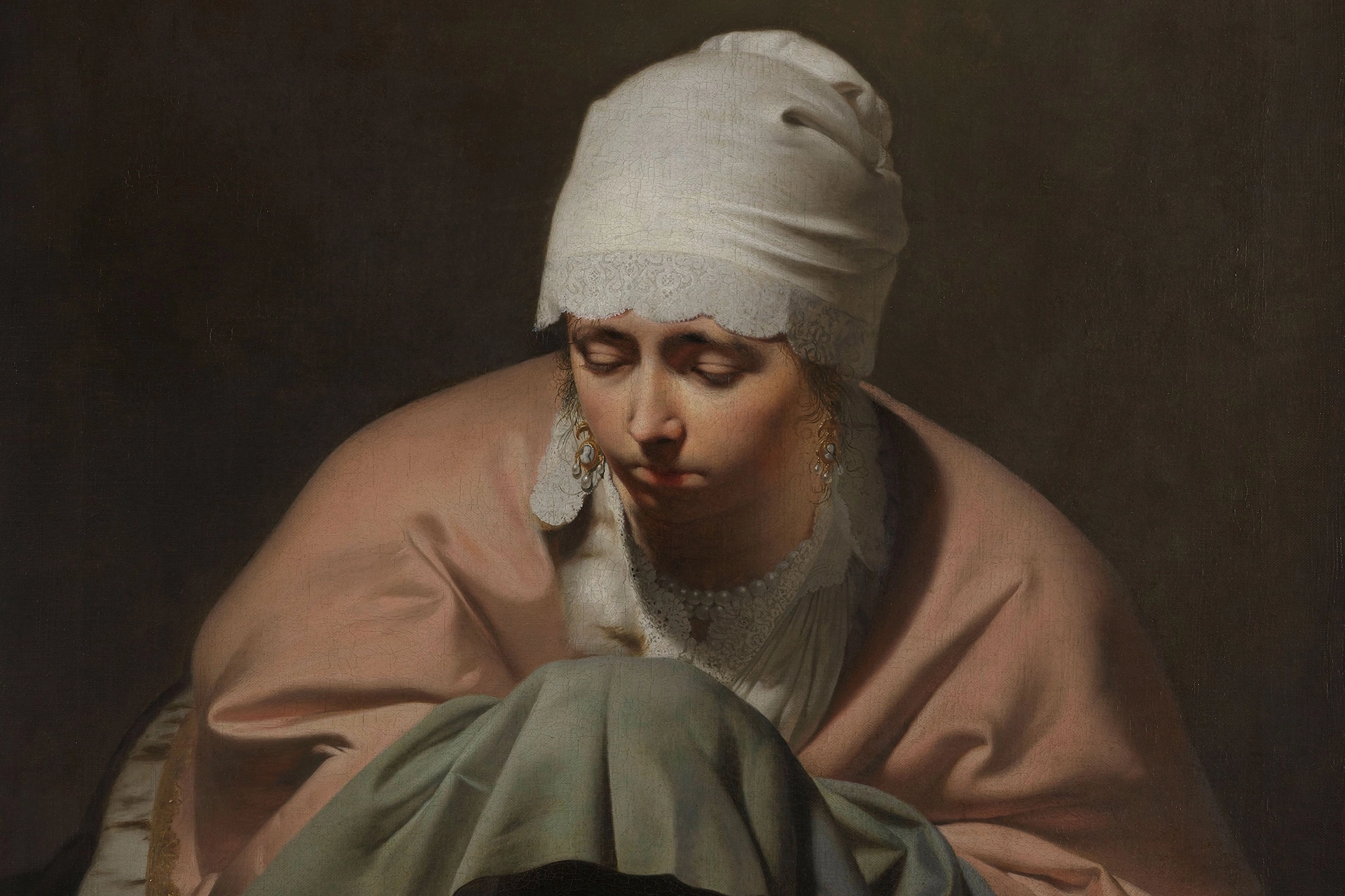
Droomkade Boutique Hotel sits on the IJsselkade in Zutphen, in a place where movement slows down by itself. The hotel is meant as an in-between space: a moment of arriving, letting go and setting off again. That thought forms the foundation of the brand. Not by adding style, but by creating coherence between location, story and experience. What becomes visible confirms what you experience – without explanation.
- Client
- Droomkade Boutique Hotel
- Location
- Zutphen
- Made
- Brand foundation
- Symbol and wordmark
- Colour and typography
- Print and signage
- Digital applications
- Interior and communication guidelines
What is visible confirms the experience – without explanation.
Brand Design™.
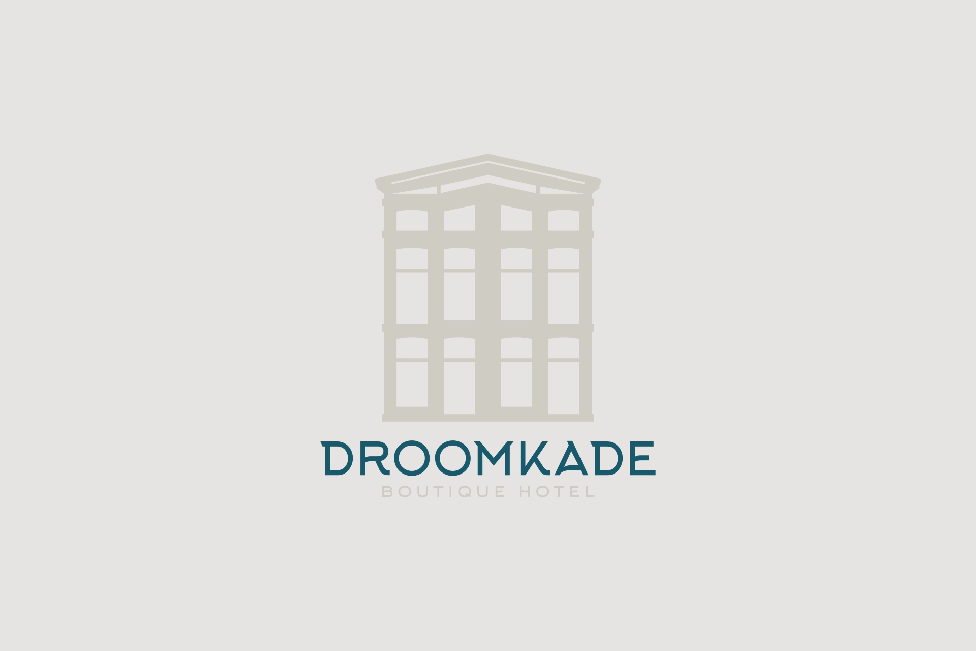
The brand design is built on calm and refinement. The symbol subtly refers to the townhouse on the quay and to water and nature, without becoming literal. Architectural forms have been reduced to simple lines and proportions, keeping the logo timeless and recognisable.
The colour palette – with brown and green as its basis and refined accents of gold and cream – supports the feeling of luxury and serenity. The typography balances between classic and modern and contributes to a restrained, exclusive look.
Brand Activation™.
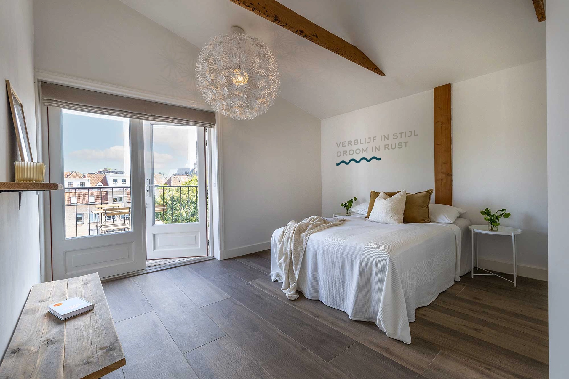
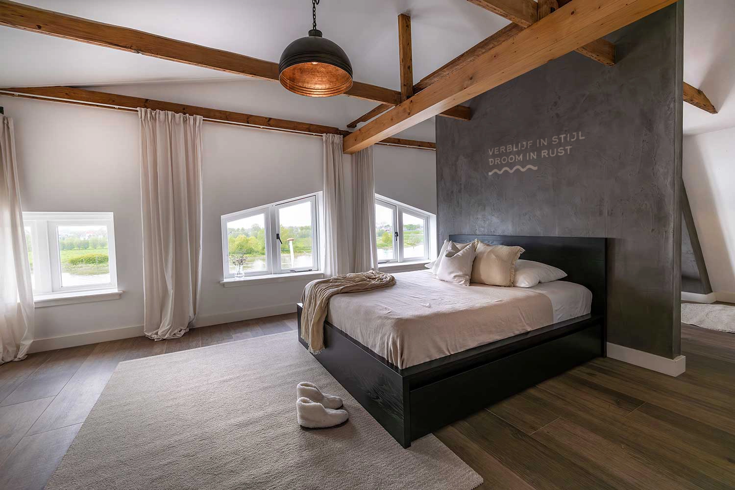
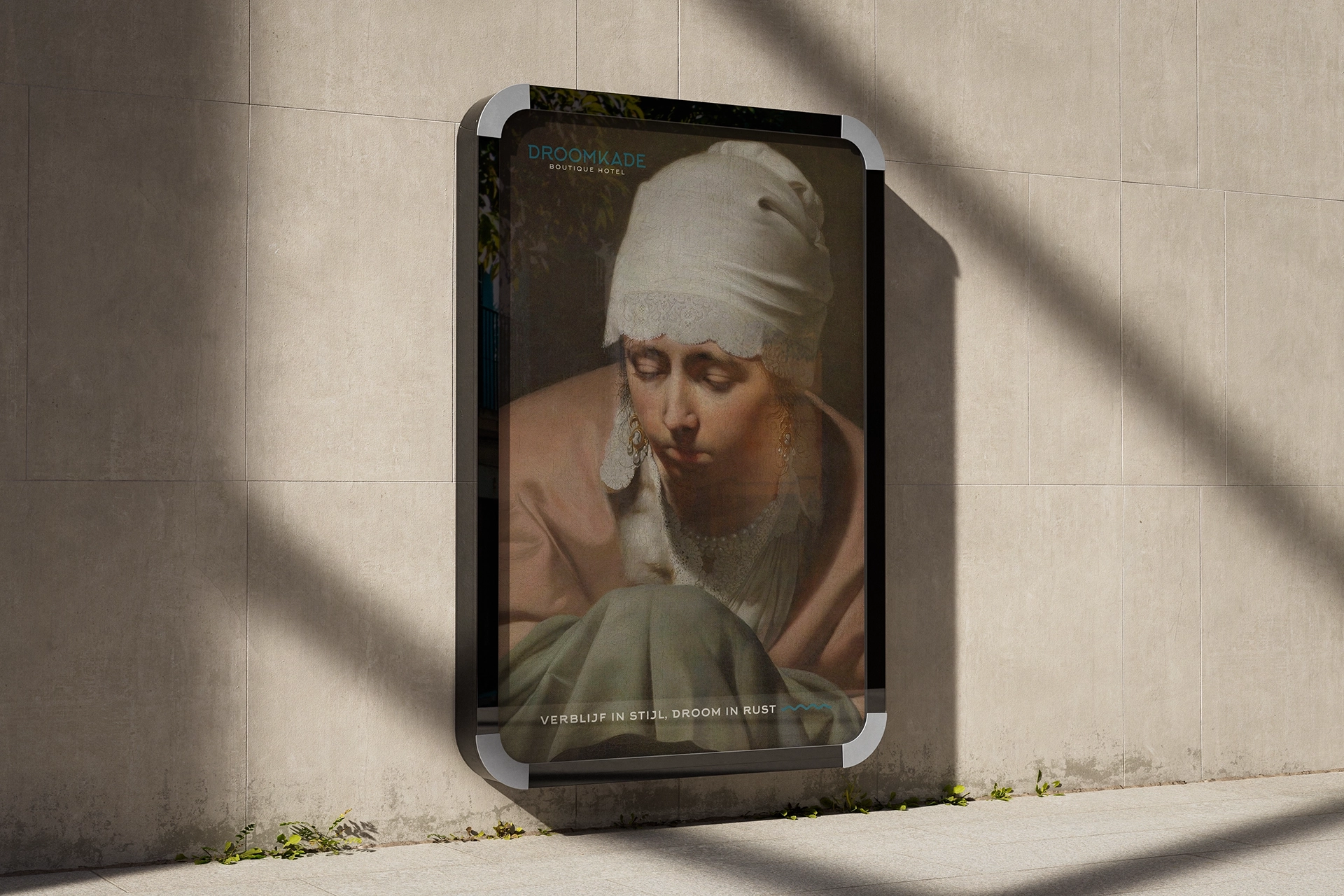
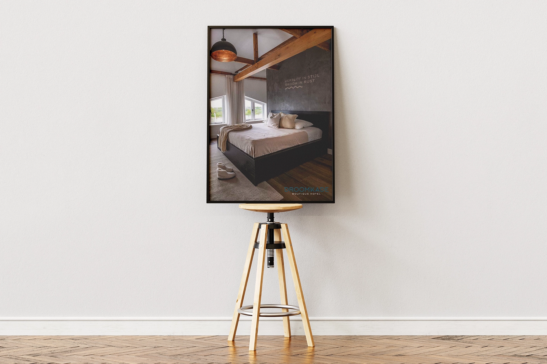
The brand identity has been consistently carried through to every visible point of contact. Not as separate materials, but as one continuous experience. Online and offline expressions follow the same cadence and reinforce each other in tone, rhythm and look. Activation here is not about visibility, but about confirmation. Every material supports the feeling of calm and attention that guests experience on arrival and during their stay.
Materials developed.
Together, the symbol and wordmark form the basis of the identity and are supported by a consistent colour and typography system. These visual choices have been carried through into print, signage and digital applications, and also form the framework for interior and communication guidelines. All materials come from one brand idea and do not function separately, but as a coherent whole.
A brand that holds together.
From the brand foundation, a visual identity was developed in which historic charm and modern elegance come together. The symbol subtly refers to architecture, water and nature. The colour palette and typography strengthen the feeling of luxury and serenity. Design and application are expressions of one idea. The same cadence runs through every material, so what is visible confirms the experience – without explanation.
Our role.
Together with the client, we wrote and sharpened the brand foundation: the meaning of the quay, the promise of calm and the balance between historic charm and modern elegance. From that foundation, we carried the identity through into Brand Design and Brand Activation, and made choices consistent in tone, system and application.
Why this works.
Because the brand is built not on style, but on meaning. The identity fits the place, the story and the pace of Droomkade Boutique Hotel. That makes everything feel self-evident. What guests see confirms what they experience – and that creates calm, recognition and trust.