Work · VFB
A brand for functional management that rings as true as the work itself.
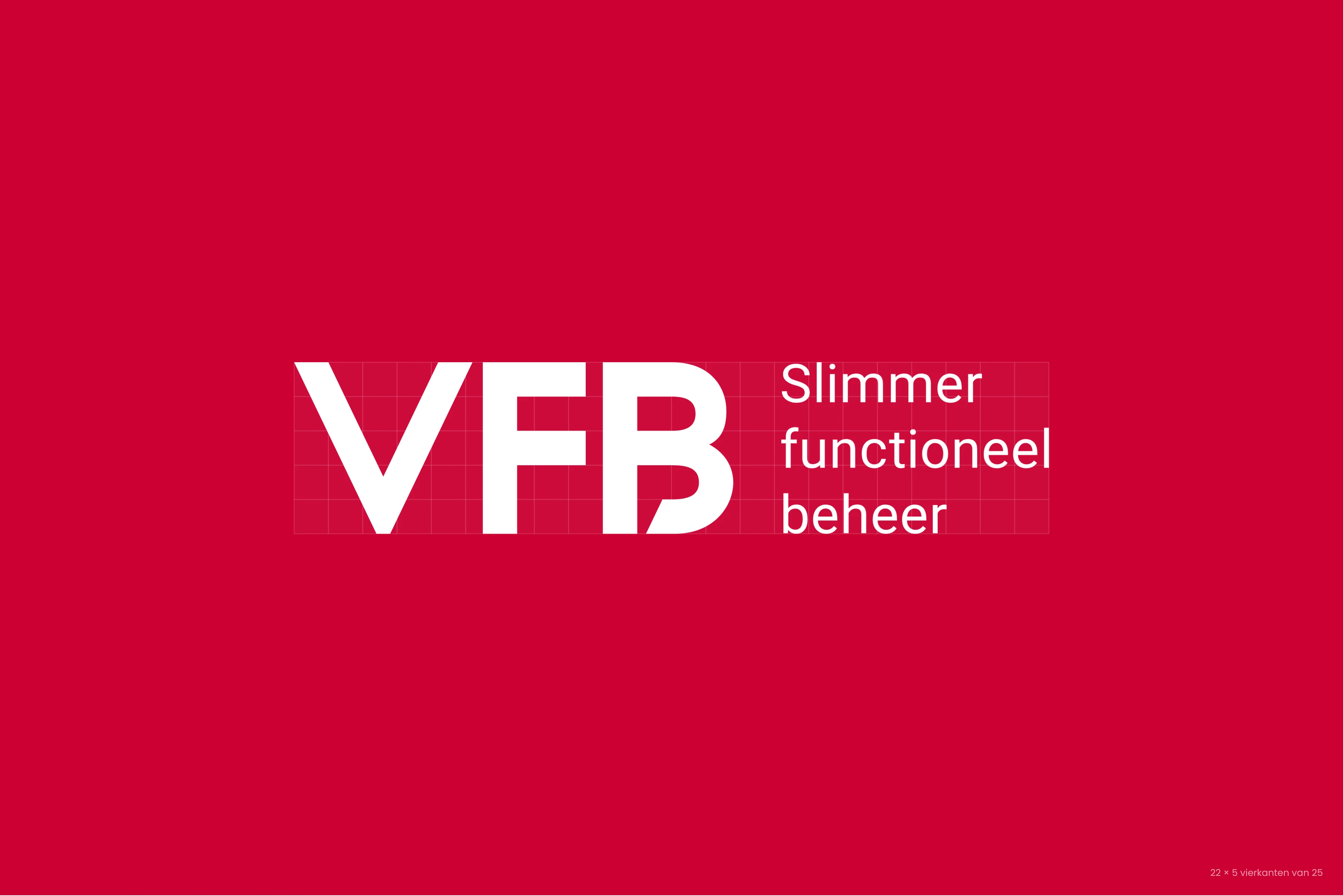
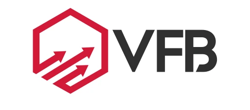
VFB makes functional management smarter. The brand was a name with a promise beside it. We made it one whole: the hexagon gone, a logo on a fixed grid and colours set once and for all.
- Occasion
- Confirming an existing logo
- Client
- VFB
- Location
- Nationwide
- Made
- Logo Confirmation™
- Logo construction
- Colour system
- Brand Guide
- Design System
- Together with
- Daniël E. Brouwer
- Online
- vfb.nl
Smarter functional management starts with a brand that rings true itself.
Brand Design™.
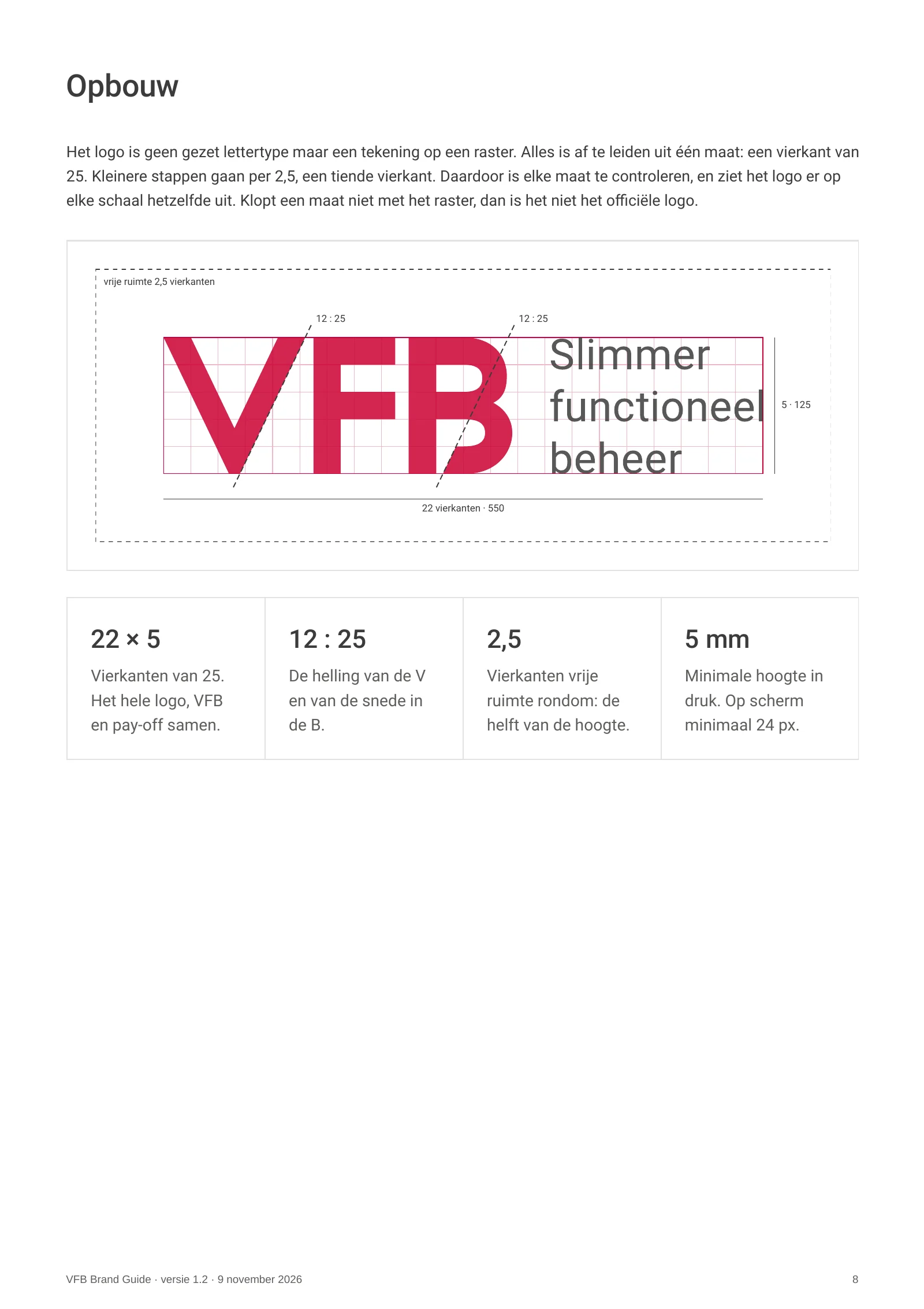
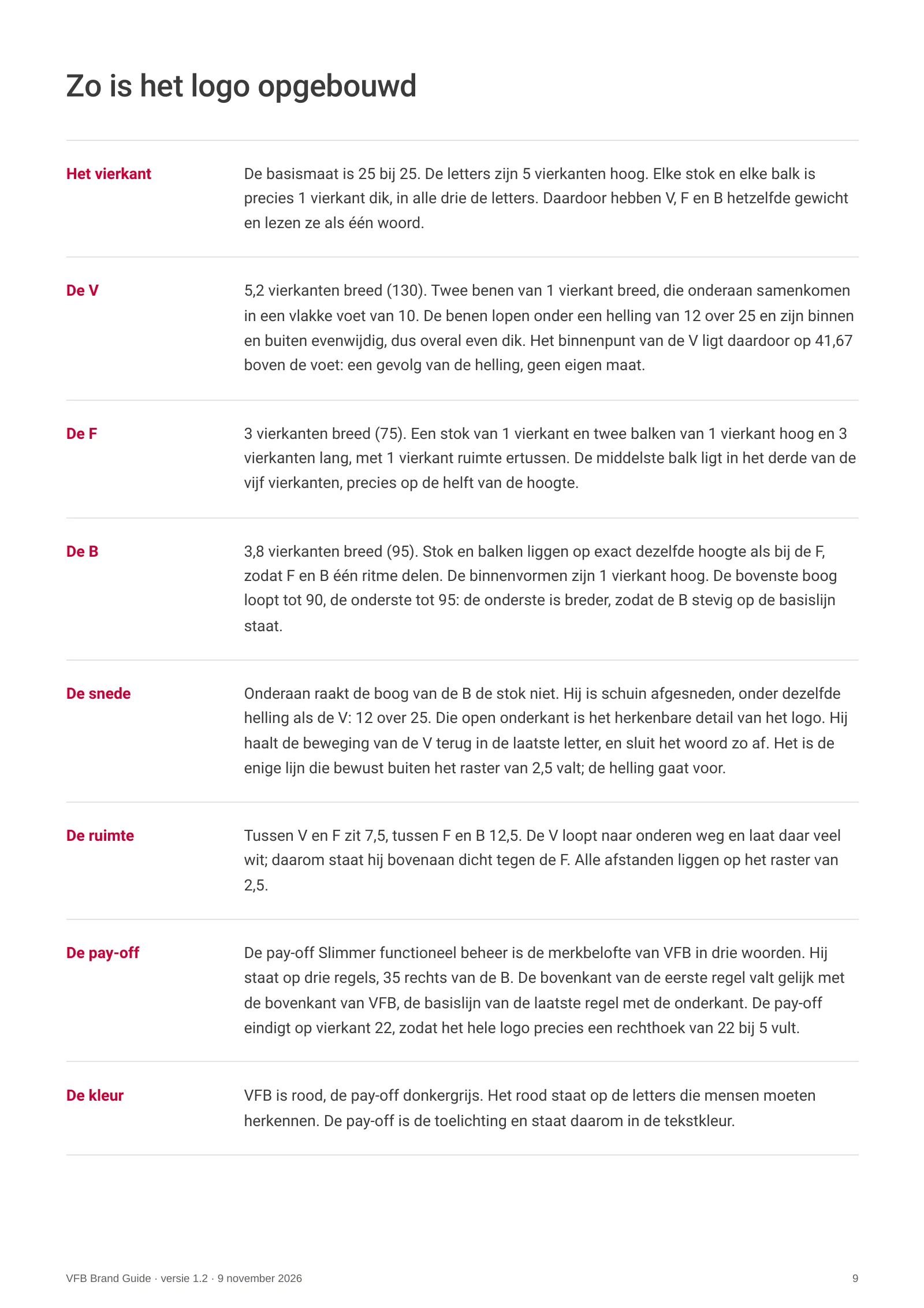
The hexagon went. What remained was given a fixed measure: a grid of 25 in steps of 2.5. The V and the cut in the B share the same slope of 12 in 25. Logo Confirmation™ records every variant, in every size and every colour.
Brand Activation™.
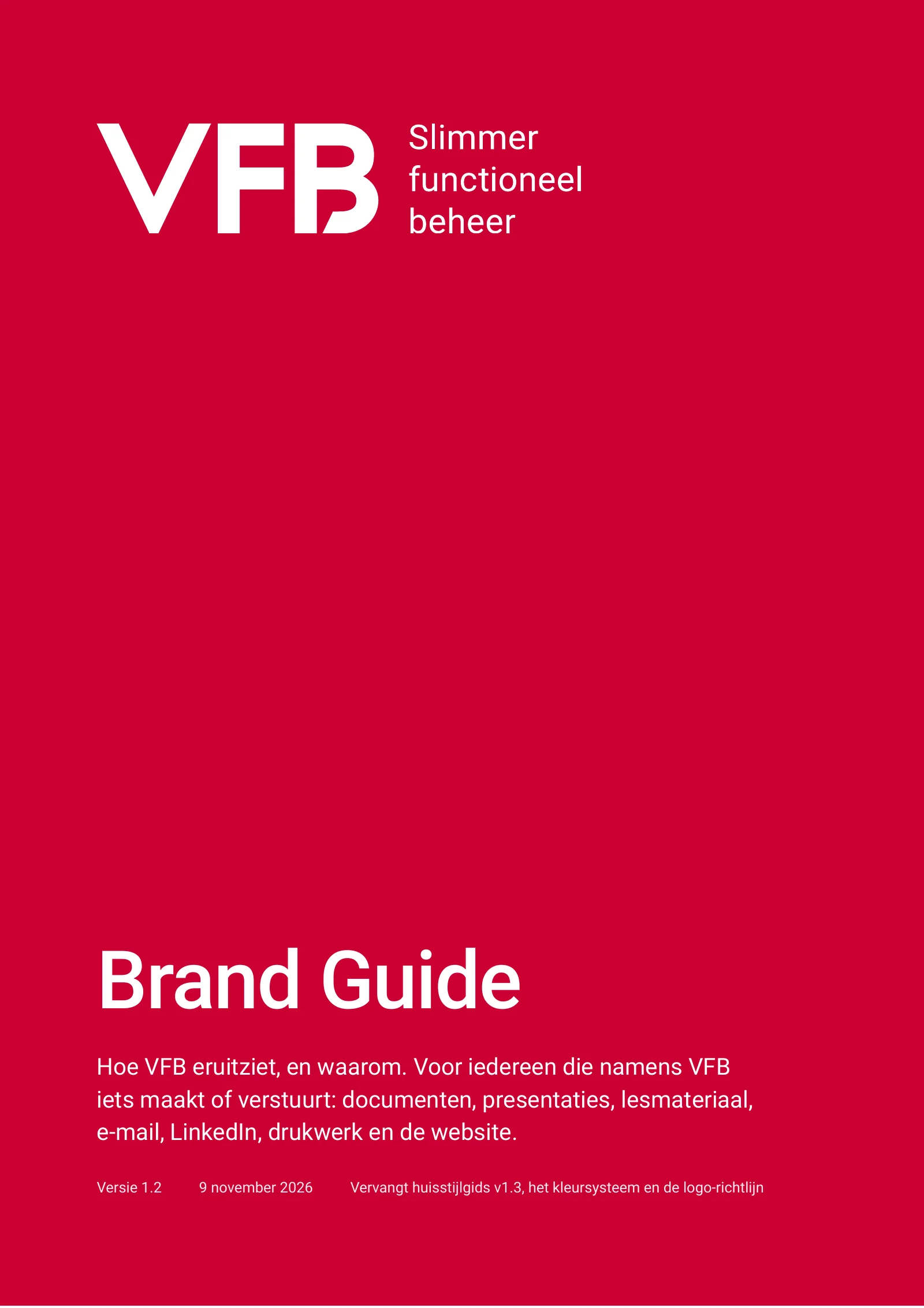
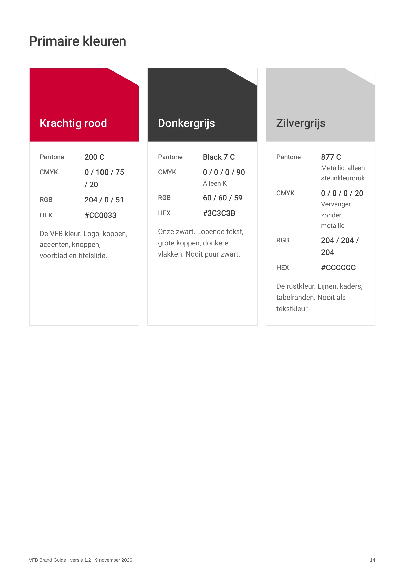
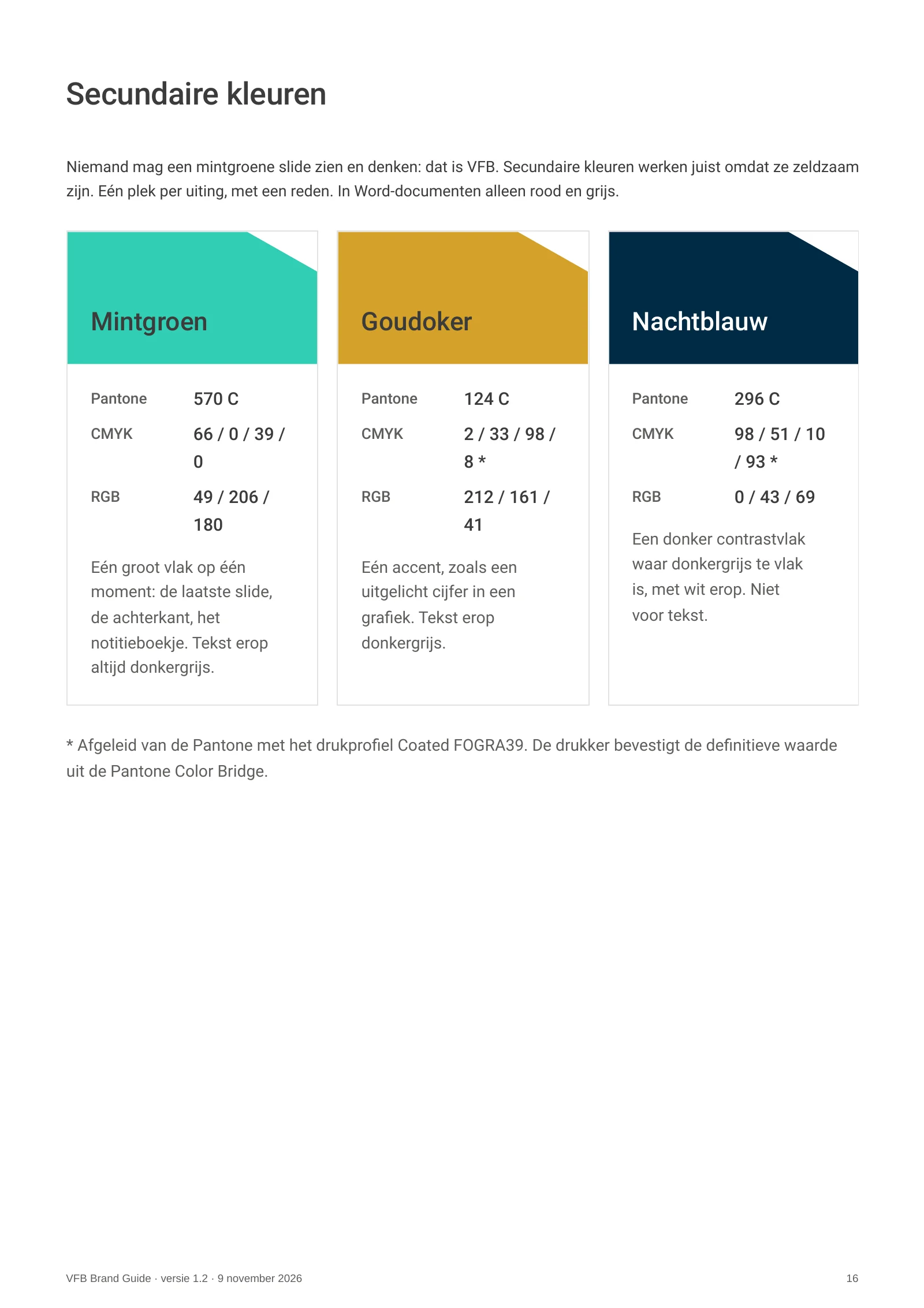
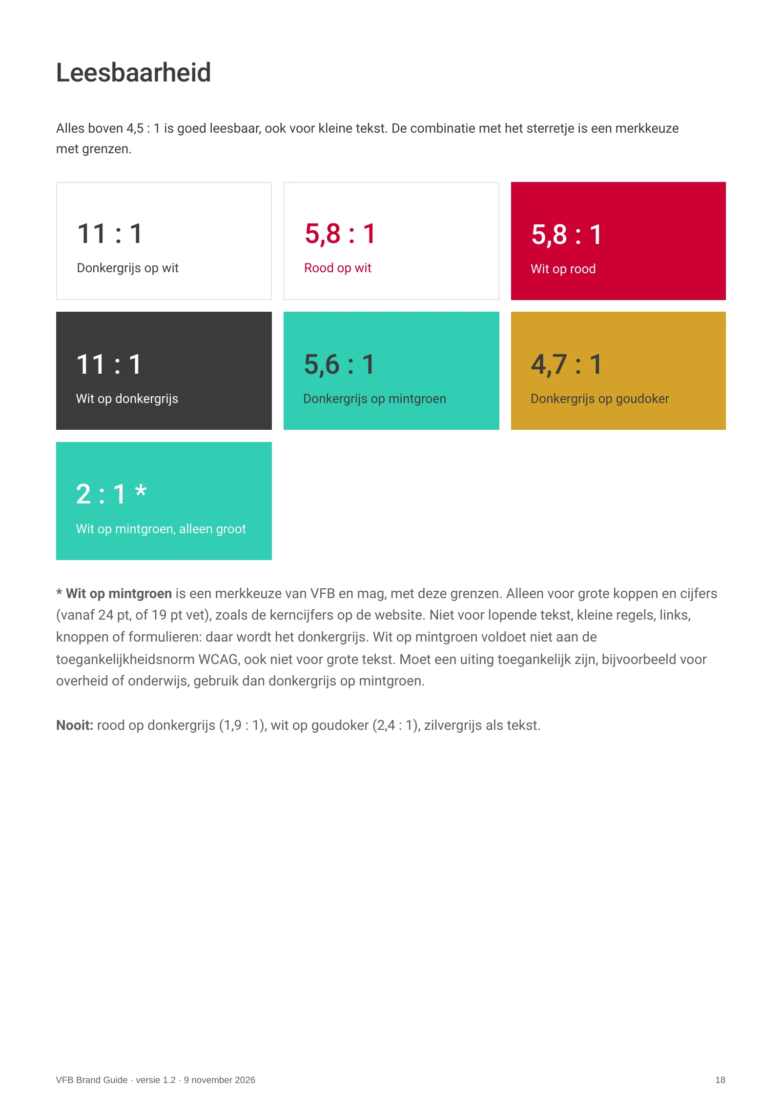
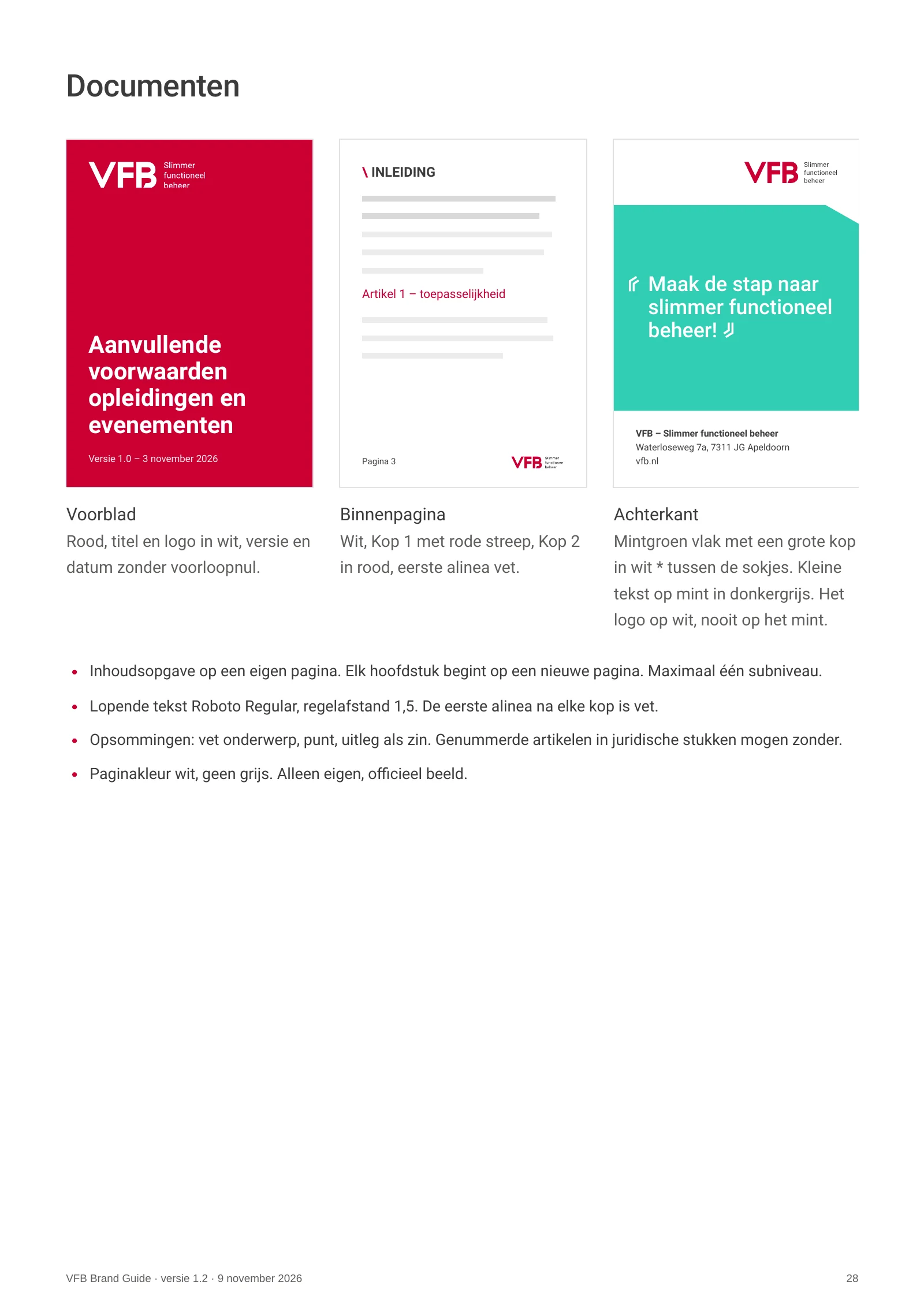
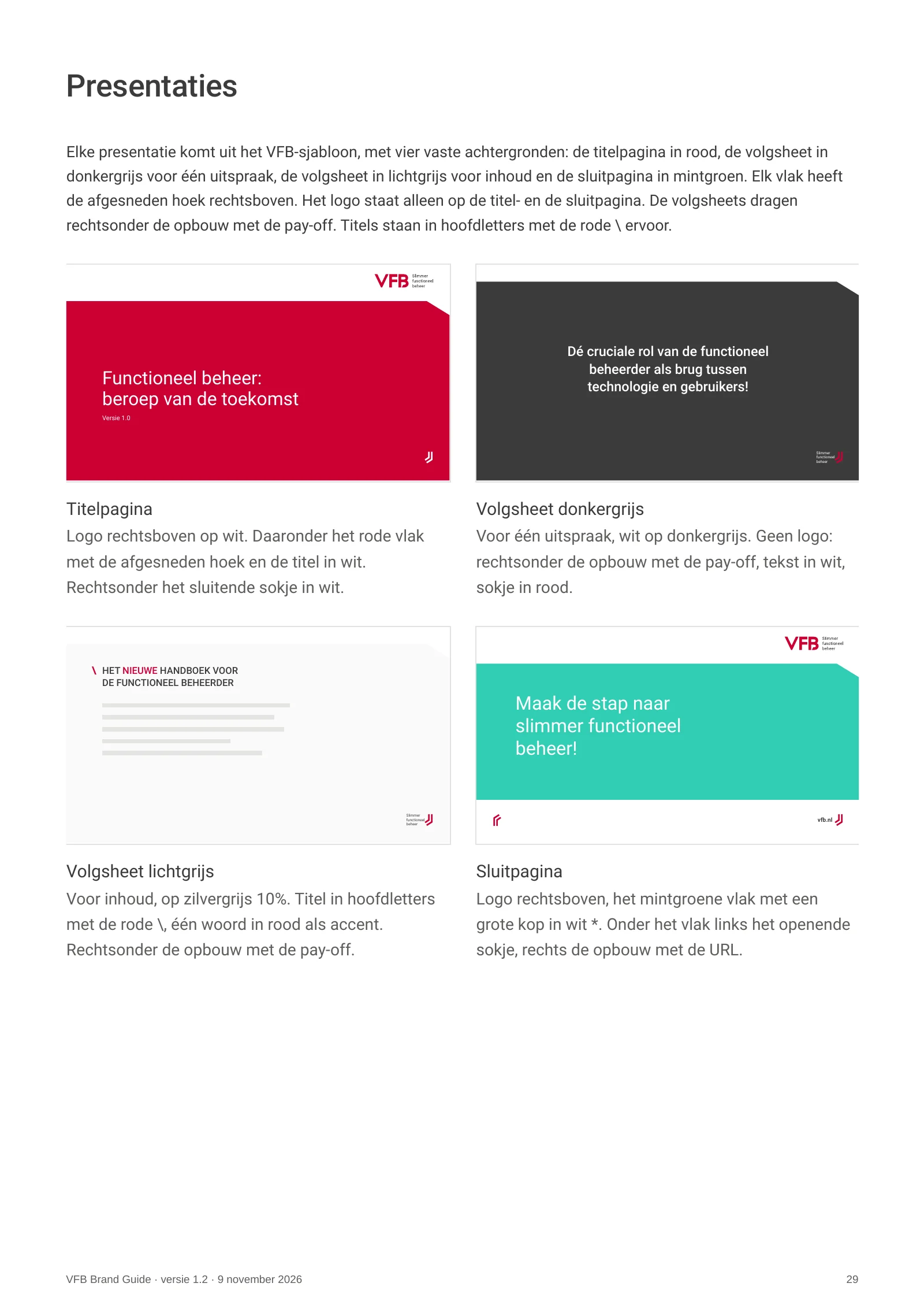
The Brand Guide carries the brand into everything VFB makes: documents, presentations, website and print. PMS leads for print, CMYK is its print version and HEX is a value of its own for screen. Suppliers receive one sheet with the right codes.



Slimmer functioneel beheer

A recognisable whole.
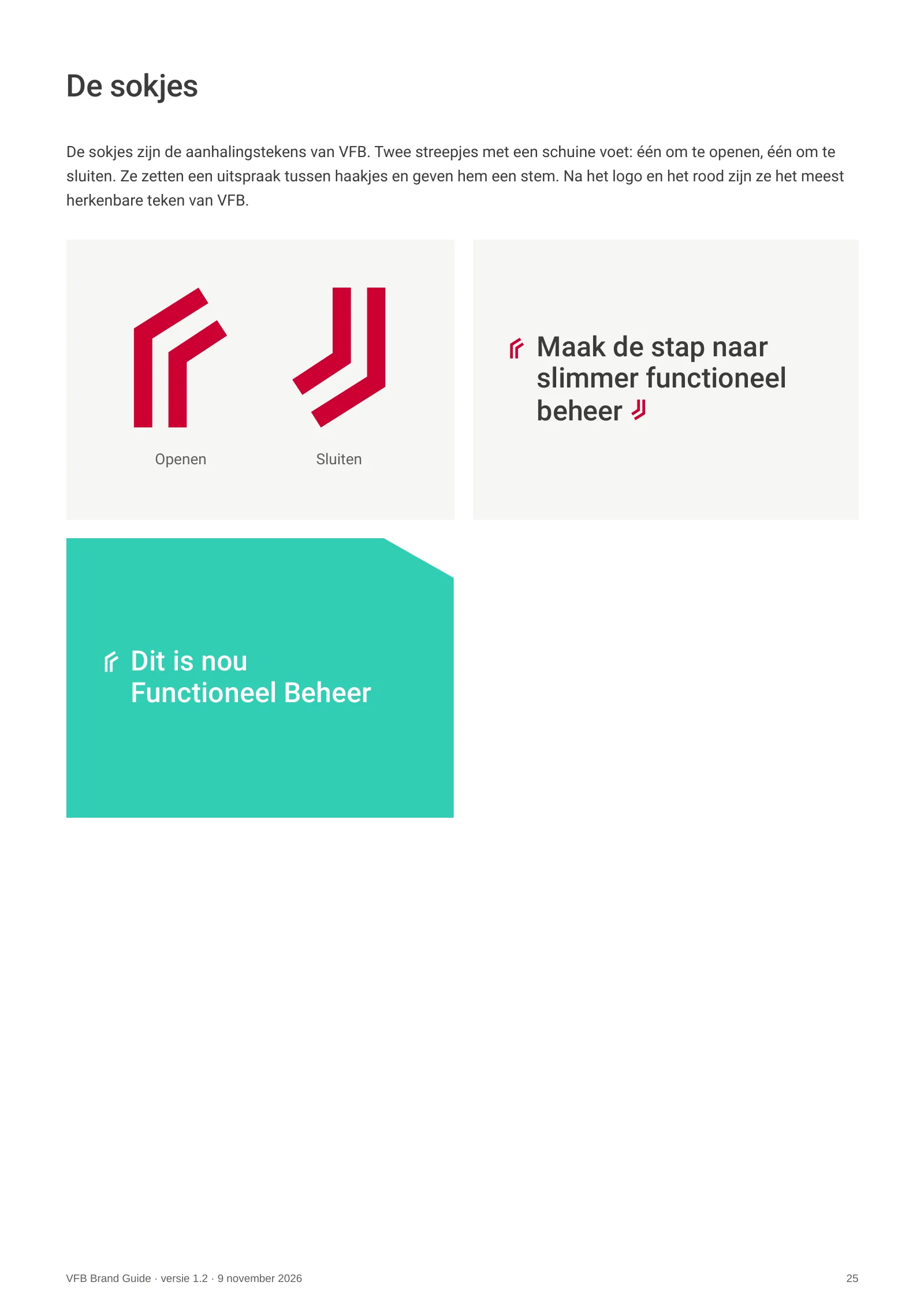
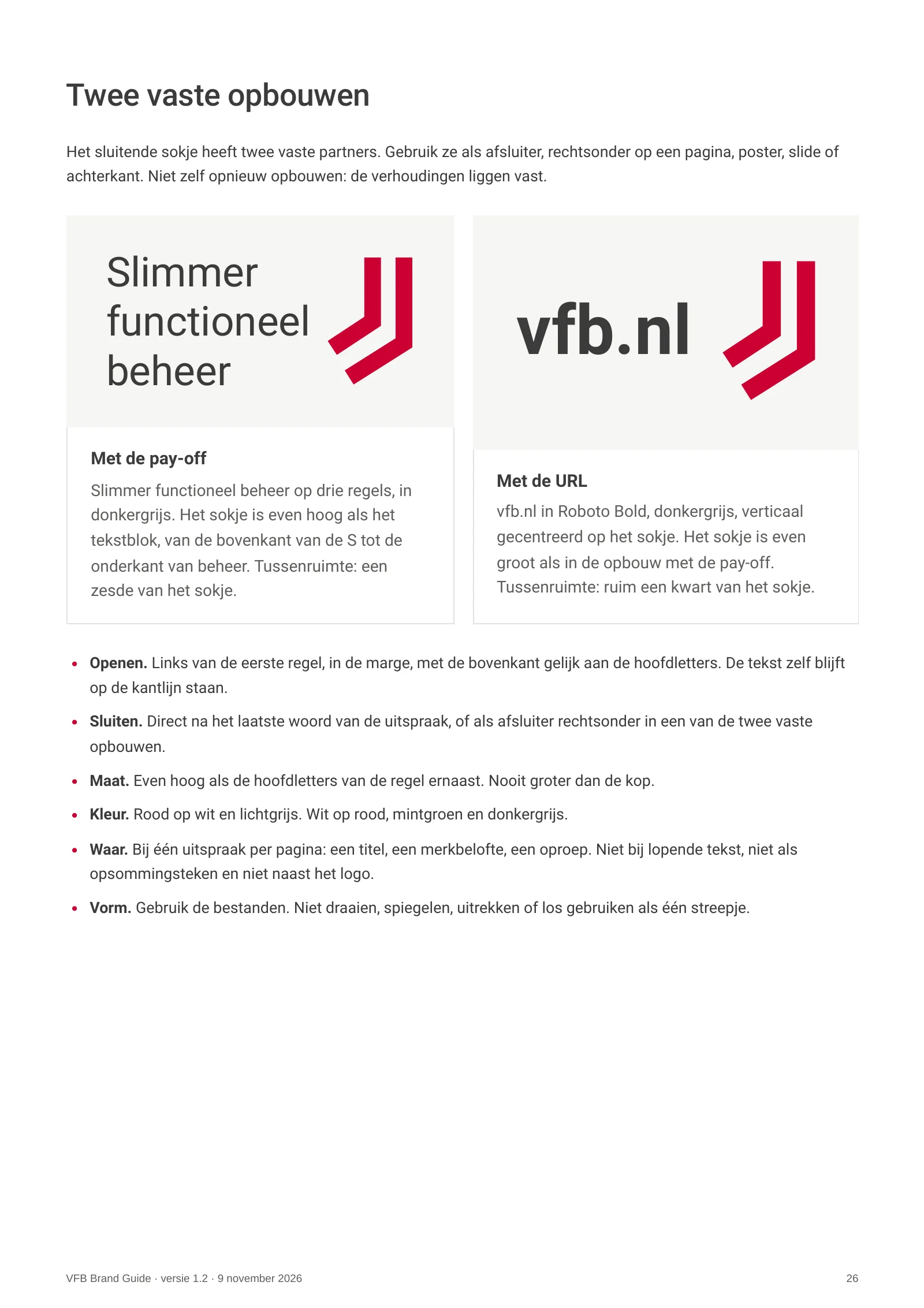
Logo, colour and promise come from the same core. The red is the same red everywhere, the promise always sits beside the letters and every point of the logo lands on the grid. What VFB shows confirms what VFB does: ordering, choosing and setting things down.
Our role.
Together with VFB we decided what could go. Then we set down what stays, down to the PMS value, and made it easy to hand over to everyone who works for VFB.
Why this works.
A brand that rings true needs no explaining. Not to clients, not to the web agency and not to the printer.
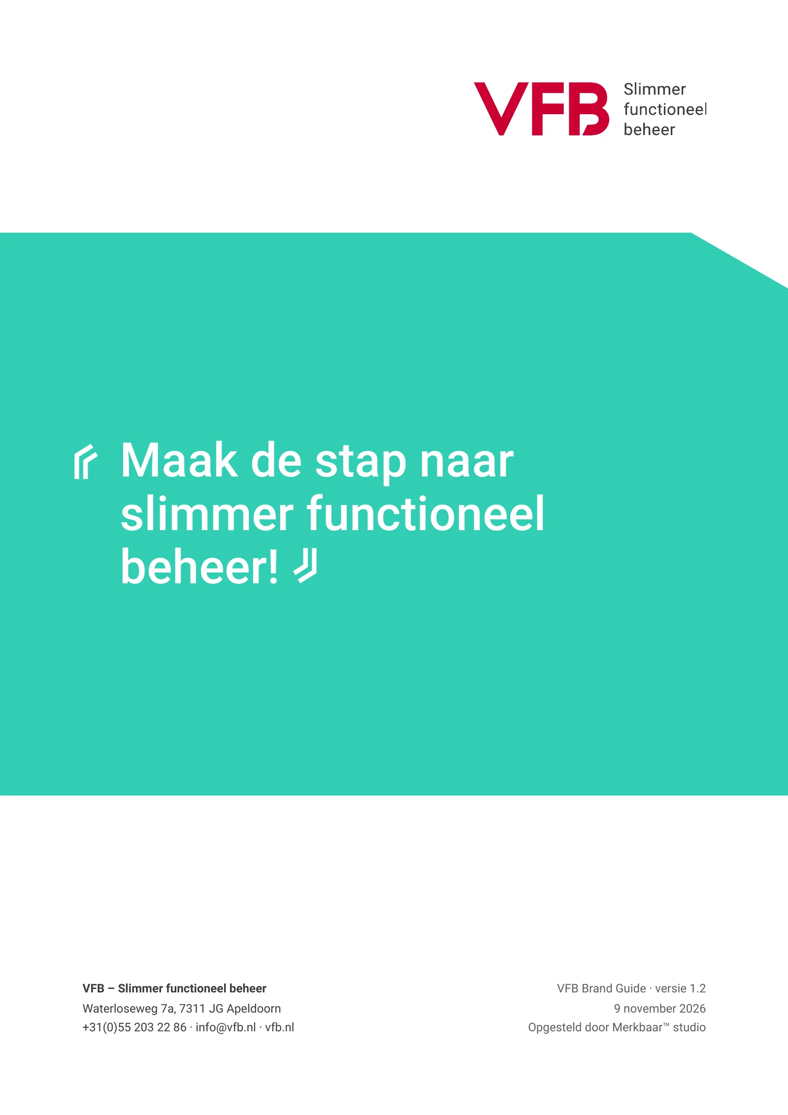

Maak de stap naar slimmer functioneel beheer