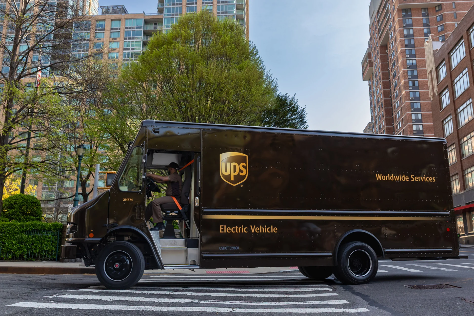
In early November, the US Copyright Office ruled that the UPS shield is not original enough for copyright. A shield, a colour gradient, three small letters. It looks like a verdict on the design, but it isn't. It measures how unusual a shape is, not how well it works. And a logo that works well is often simpler than anyone expects.
Original is not the same as good
Copyright rewards individual expression: the more a shape departs from the ordinary, the better it is protected. A logo has a different job. It has to be recognised at a glance, on a lorry, a uniform, a parcel at the door. That does not take a complicated shape, but one that stays the same everywhere. The logo remains protected, incidentally, as a trade mark. There, what counts is not how distinctively something is drawn, but what people recognise.
Simplicity is the hardest decision
A simple logo looks quick to make. Usually it is the result of leaving a great deal out. Every line that goes must be one you can do without. Every colour that stays must carry something. What remains looks self-evident. That is not a lack of design, but the proof of it.
A strong logo is not designed only to stand out, but to stay the same for long enough.
What always holds here
Designing for the long term
A logo does not gain its meaning on launch day. That grows with every use, year after year. A good logo is therefore made not for the first impression, but for the hundredth and the thousandth. A shape designed with that in mind does not need constant adjusting. It only grows stronger.
- Without directiona logo has to make an impression all over again with every revision.
- With directionevery use becomes a confirmation of what is already known.
Where design begins
Simplicity only works when it is clear what it has to carry. Without a set direction, a simple logo is empty, and form starts to compensate for what was never decided. With direction, a shield, a dot or a letter can be enough. So the question at the start of a design is not how it will stand out, but what it still needs to confirm in ten years' time.
How we make a logo that lasts
At Merkbaar™, a logo begins in Brand Foundation: that is where we set down what the brand stands for and what never changes. In Brand Design we look for the simplest form that can carry it, and leave out what does not belong. With Brand Platform we make sure that form is used the same way everywhere. So the logo is not explained again and again, but confirmed again and again.
A good logo is made to last